Table of Contents
- What controls color in an art book?
- Build the color specification before sending files
- Image profiles, CMYK conversion and black-point decisions
- Paper white, coating and the viewing environment
- Prepare images and pages for color-critical printing
- Choose offset or digital printing for the project
- Quantity, repeatability and variable page requirements
- Use proofs without misunderstanding what they show
- On-press and post-press color checkpoints
- Spot colors, lamination and surface appearance
- What to include in an art book printing quote
- FAQ: Color consistency in art book printing
- Request a color-critical book production review
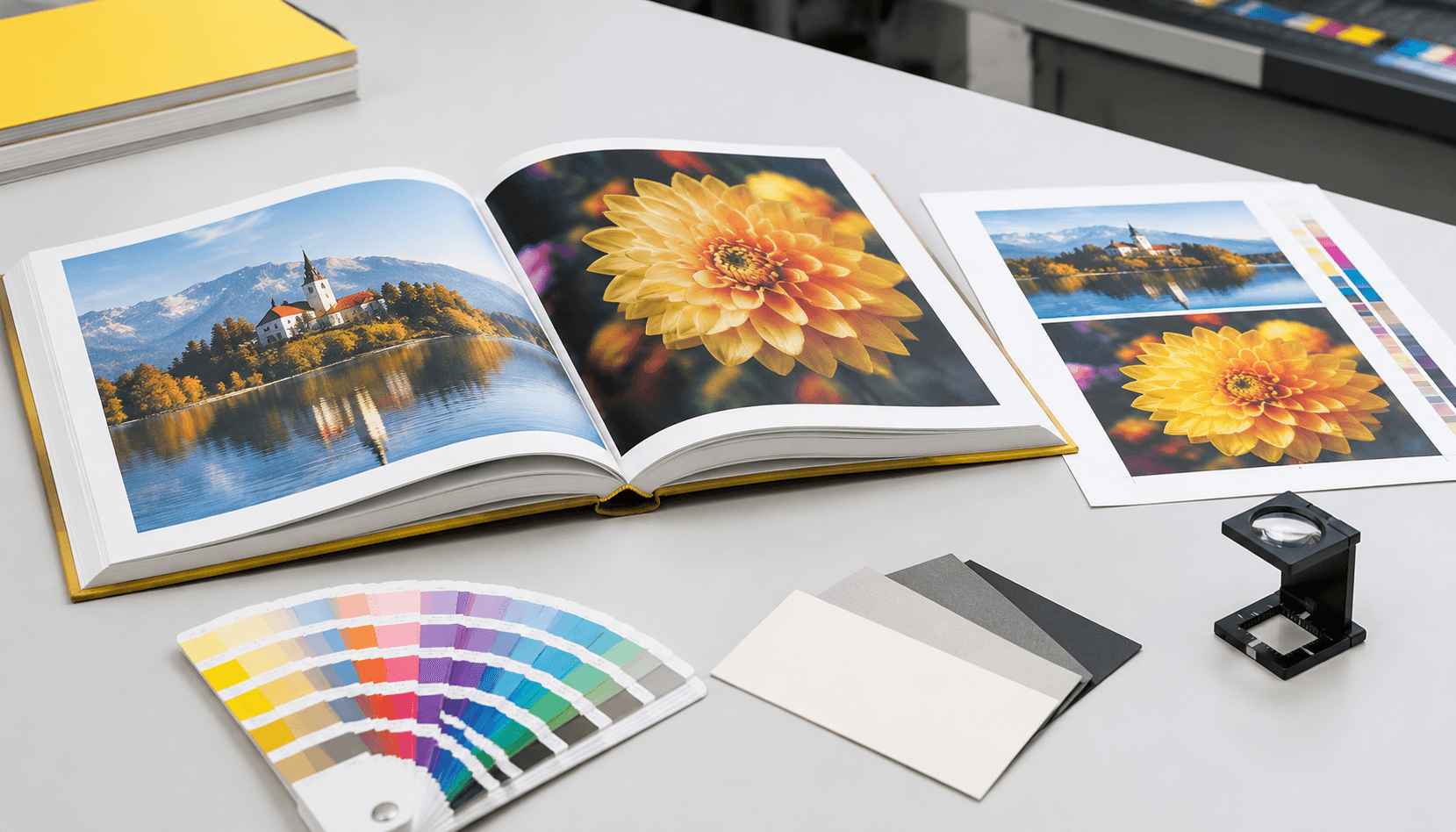
Consistent color in an art book depends on more than a correctly prepared PDF. Paper white, image profiles, proofing, press conditions, finishing and viewing light all influence the final appearance. This guide explains how to plan a color-critical art book and prepare a specification a printer can evaluate.
What controls color in an art book?
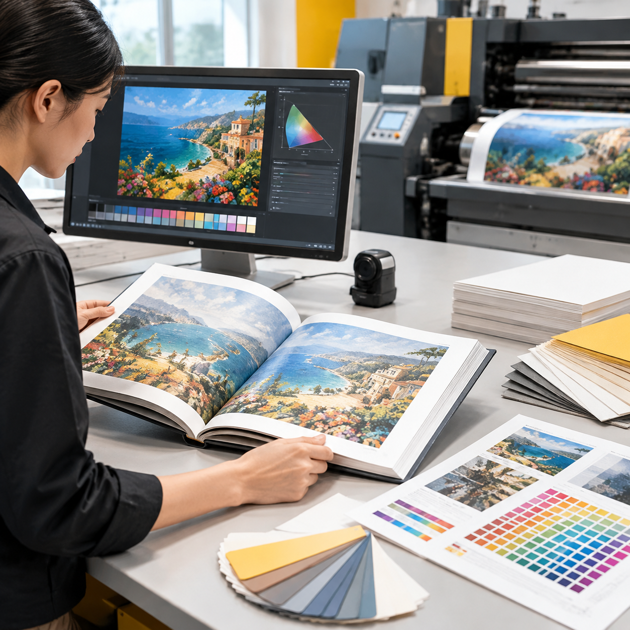
Color in an art book is controlled by the complete production chain, not by the PDF alone. Image profiles, file conversion, ink limits, paper white, press calibration, proof type, lamination and viewing light can all change how an image appears.
A correctly prepared file can still look different if it is printed on a warmer paper, viewed under a different light source or compared with a screen that has not been calibrated. This is the central issue in color-critical book printing: the file, paper, proof and production method must be defined together.
Definition: color-critical book printing means planning and checking a print job where image appearance, brand colors or repeatability matter enough to require defined profiles, paper, proofing and approval checkpoints.
Key takeaways for buyers
- Approve the paper and proofing method before approving a large production run.
- Use the same image profile and conversion logic across the complete book.
- Judge a proof under suitable light rather than against a bright computer display.
- Do not compare an unlaminated proof with a laminated finished page and expect identical surface appearance.
- Ask the printer how color will be monitored during make-ready, press production and final inspection.
Lemon Printing produces books in an in-house facility with offset and digital presses, so the production discussion can cover prepress, proofing, printing, binding and finishing as one specification. Its custom book printing service supports formats such as hardcover, paperback, sewn and casebound books.
Build the color specification before sending files
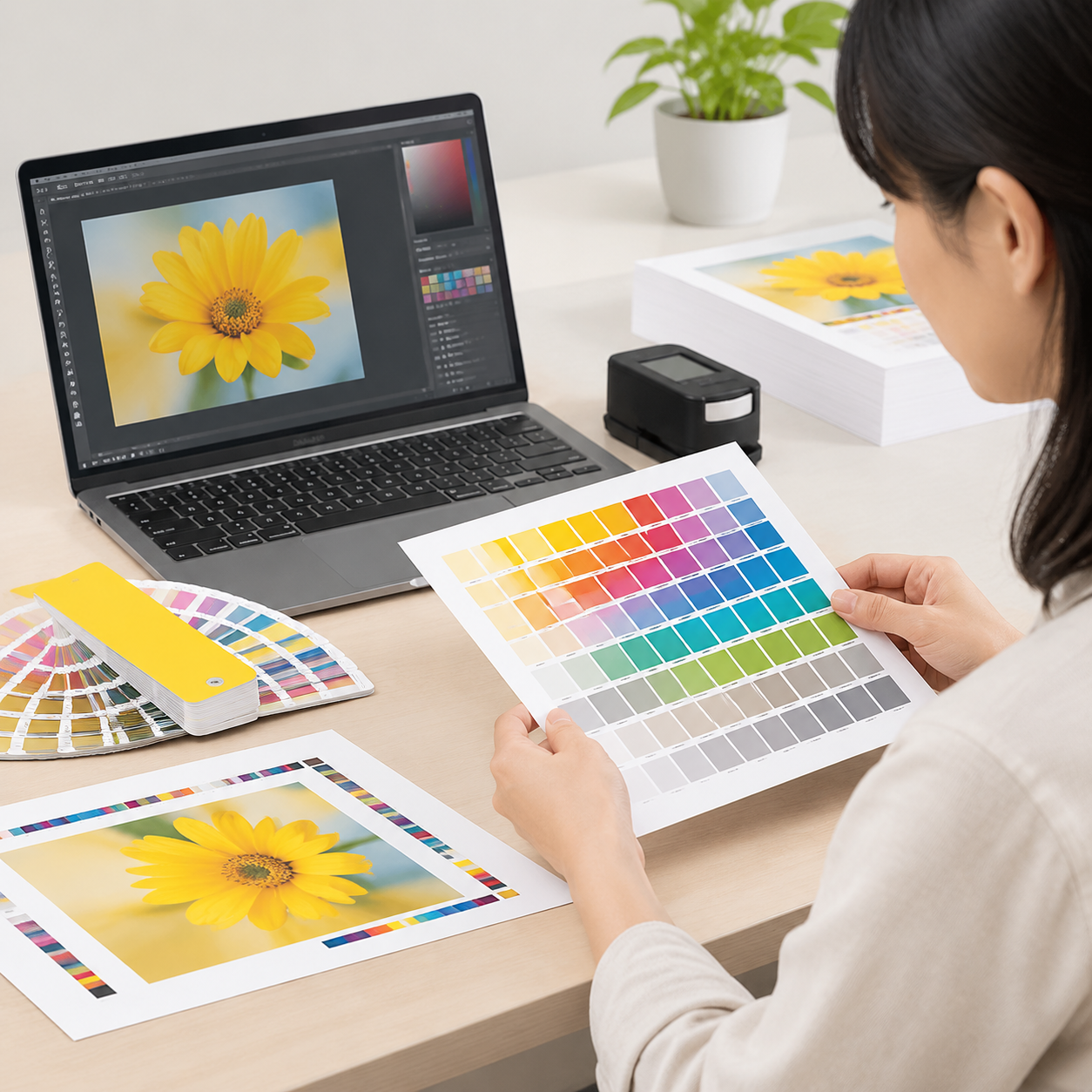
Start with a written color specification before artwork is finalized. The specification should identify the intended appearance, paper, printing method, profile assumptions, proof type and approval authority. This prevents the printer from making avoidable assumptions after files arrive.
For a photography book, the priority may be neutral skin tones, shadow detail and smooth gradients. For an artist monograph, saturated colors and accurate reproduction of original work may matter more. A brand-led art book may also include a small number of colors that must match an approved brand reference.
Record these decisions
- Color objective: describe the images or colors that receive the closest attention.
- Paper: specify the stock, approximate weight, coating and paper color or whiteness preference.
- Printing method: identify whether the project is being evaluated for offset, digital or both.
- Color spaces: state the working profiles used for RGB images, CMYK pages and any spot colors.
- Proof: define whether you need a contract-style color proof, a printed page sample or a bound dummy.
- Finishing: include lamination, varnish, spot UV or other treatments that can change surface contrast.
- Approval: name the person who can approve the proof and define whether later changes require a new proof.
For international projects, also record the destination and intended viewing environment. Final MOQ, production time, pricing and shipping depend on the finished size, page count, materials, quantity, finishing and delivery destination.
Image profiles, CMYK conversion and black-point decisions

Prepare images in a controlled color workflow, but confirm the final conversion requirements with the printer. RGB files can contain colors that a CMYK printing process cannot reproduce. CMYK conversion changes those colors into combinations of cyan, magenta, yellow and black that fit the selected print condition.
Do not convert some pages early with one profile and other pages later with a different profile unless the change is intentional and documented. Mixed conversion workflows can create visible shifts between adjacent images. Keep the original RGB files separately, then create production files using the agreed profile and export settings.
Black-point decisions also matter. Black point is the darkest tone the process can reproduce with useful detail. Excessive total ink can cause slow drying, set-off or blocked shadows, while too little black can make deep tones look weak. Rich black may be suitable for large graphic areas, but small type and fine lines generally require a controlled black treatment to avoid registration problems.
For image-heavy pages, check:
- Effective resolution at the final placed size; around 300 ppi is a common working target for detailed images, but the printer should confirm the requirement.
- Clipping in highlights and shadows after conversion.
- Neutral gray areas, skin tones and gradients.
- Transparency, overprint and profile settings in the exported PDF.
- Whether the same conversion and ink-coverage rules apply to every page.
Paper white, coating and the viewing environment
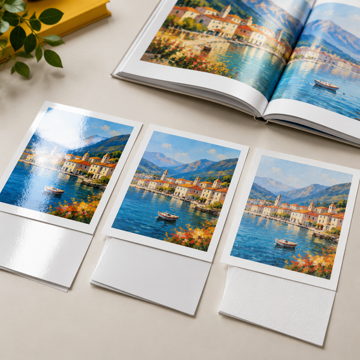
Coated paper is often a strong choice for detailed, full-color art books, but it is not automatically better for every project. A coated surface is smoother and usually supports crisp image reproduction, fine detail and stronger apparent color. A matte or silk coating can reduce glare compared with a high-gloss surface. Uncoated paper may provide a softer, more tactile appearance, but it can absorb ink differently and reduce apparent sharpness or saturation.
Paper white is part of the color equation. A warm stock can make neutral grays, whites and cool colors appear warmer. A brighter stock may make images look more open, but the perceived result still depends on coating, ink and light. The same CMYK values can therefore look different on two papers.
| Paper option | Typical visual effect | Useful for | Buyer caution |
|---|---|---|---|
| Gloss coated | High apparent contrast and sharp detail | Photography, vivid portfolios and image-led spreads | Glare can make viewing difficult; lamination changes the surface again. |
| Matte or silk coated | Detailed reproduction with less reflective glare | Art books intended for regular handling and gallery-style viewing | Ask for a physical sample because different surfaces affect saturation and black density. |
| Uncoated | More tactile, softer and often warmer appearance | Illustration, editorial or material-led art books | Ink absorption can reduce fine detail and change color density. |
Ask to see the proof on the selected paper, or at least compare a paper dummy and a representative printed sheet. Evaluate it under a neutral, consistent light source rather than direct sunlight or a brightly illuminated monitor.
Prepare images and pages for color-critical printing
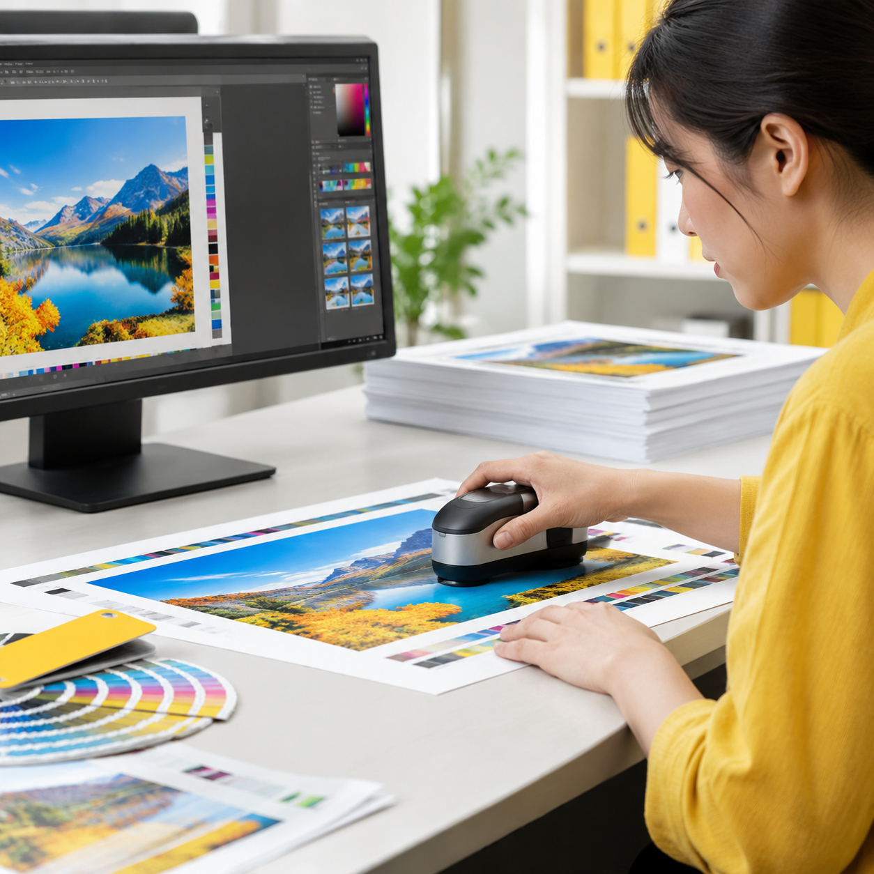
To prepare images for art book printing, standardize the files, check them at final size and export a print-ready PDF with the printer’s specifications. The objective is not simply to make every image look attractive on screen; it is to make the production intent clear and repeatable.
- Organize source files: keep original camera or scan files, edited masters and production copies in separate folders. Use clear page and image names.
- Set the final page size: place images at their actual size so resolution and cropping can be checked accurately.
- Confirm bleed and trim: extend full-bleed images beyond the trim line according to the printer’s file guide, and keep important details away from the edge.
- Check spreads: review image continuity across the gutter. Binding can hide part of a spread, especially in thicker or tightly bound books.
- Inspect converted images: review skin tones, gradients, neutral objects, deep shadows and highly saturated colors after conversion.
- Export consistently: use the agreed PDF standard, embed or manage profiles as instructed, and avoid unexplained page-by-page changes.
- Supply a visual reference: include a low-resolution reference PDF or annotated proof notes so the production team knows which details require attention.
A prepress check should catch missing fonts, low effective resolution, incorrect page size, missing bleed, transparency issues and unexpected spot colors. It cannot, by itself, guarantee that a screen display and printed page will look identical.
Choose offset or digital printing for the project
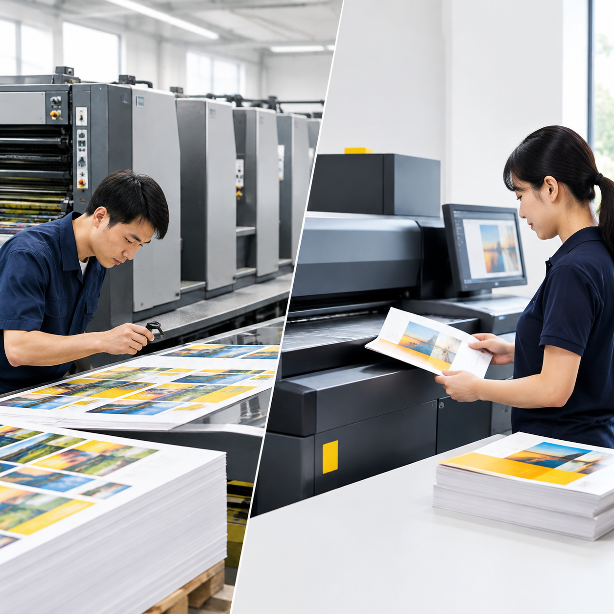
Choose offset when the planned quantity, repeatability and color stability justify press setup; consider digital when the quantity, schedule or page requirements favor a more flexible process. Neither method is universally more color-accurate. The appropriate choice depends on the artwork, run size, paper, proofing plan and repeat-order expectations.
| Factor | Offset art book printing | Digital art book printing |
|---|---|---|
| Best fit | Medium or larger runs with stable page content | Shorter runs, test editions or changing page content |
| Color behavior | Strong repeatability after press make-ready and controlled on-press monitoring | Consistent page-to-page output is possible, but the device, substrate and job setup still matter |
| Setup | Requires plate and press preparation, so setup has greater importance in the quote | Usually has less physical setup, which can suit smaller quantities |
| Paper and finishes | Broad commercial paper and finishing planning options, subject to the selected press | Must be checked for digital-device compatibility and surface behavior |
| Repeat orders | Useful when the same specification will be reproduced in planned runs | Useful when quantities are smaller or files may change between editions |
Lemon Printing operates both offset and digital presses, allowing the production review to compare methods against the actual specification rather than selecting by quantity alone. A sample or proof should still be evaluated on the intended paper and with the proposed finishing.
Quantity, repeatability and variable page requirements
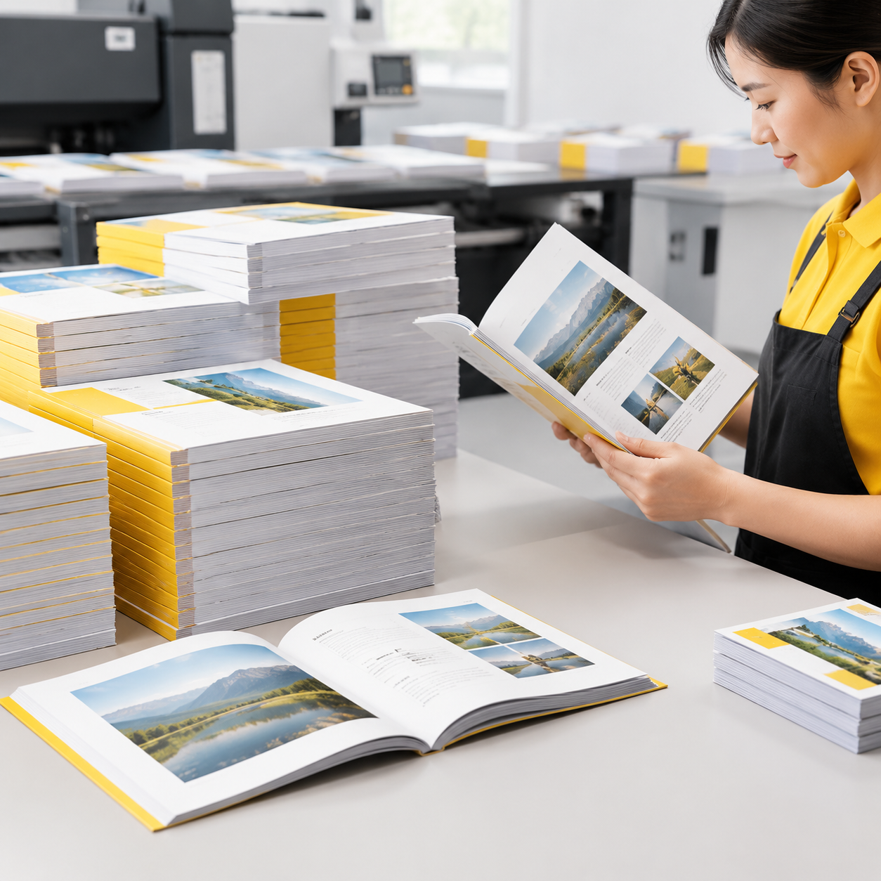
Quantity affects the economics and practical repeatability of the chosen process, but it does not replace a color plan. If an art book will be reprinted with the same files, document the approved paper, proof reference, profile approach and finishing. A repeat order can then be compared against the original specification instead of relying on memory.
Variable page requirements also matter. Different paper sections, tipped-in images, inserts or pages supplied at different times may require separate production checks. If the book includes several papers, ask whether each section will receive its own proof or whether a representative sample is sufficient.
For a first edition, buyers should decide whether a short digital run is a market test or whether the production method must match a later offset edition. If the appearance needs to carry across editions, ask the printer to explain how the proof and approved reference will be used when the method changes.
Use proofs without misunderstanding what they show
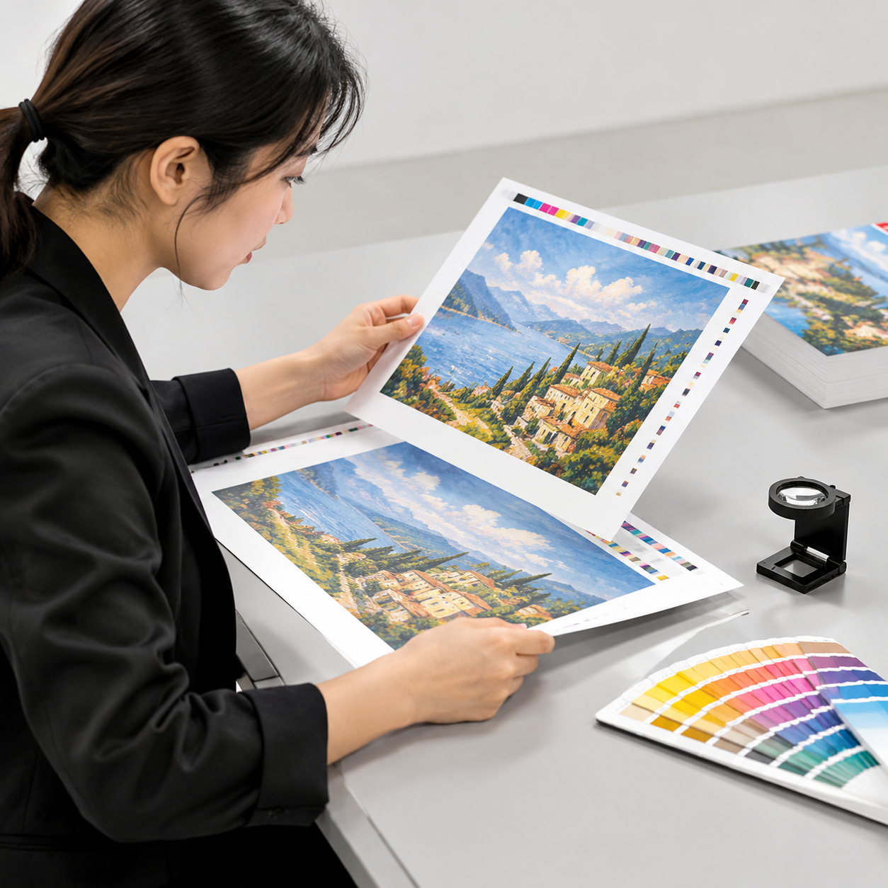
A digital proof is a color reference for approval; it is not automatically the same as a finished printed book. A proof may be produced on a proofing device, while the book may run on an offset press or a production digital press. The proof and production process can use different inks, substrates, screening behavior and surface finishes.
| Proof type | What it helps evaluate | What it may not predict exactly |
|---|---|---|
| Digital color proof | General color direction, cropping, page sequence and many image relationships | Final press texture, exact coating appearance, binding behavior and every production-page variation |
| Printed production sheet | Actual paper, ink or toner behavior and finishing interaction on a representative page | The complete book unless more pages are sampled |
| Bound dummy | Trim, thickness, page order, binding, cover construction and handling | Color consistency unless its pages are printed using the intended production process |
When reviewing a book printing proof, compare the proof with the approved reference under stable light. Mark specific issues such as a shadow losing detail, a neutral area turning warm or a brand color shifting. Avoid comments such as “make everything brighter” unless the desired change is defined.
Proof approval should also confirm the page count, trim, bleed, image cropping, cover treatment and binding construction. Once approved, retain the signed or documented reference and identify which later changes require a new proof. Lemon Printing describes its broader commercial printing process around project review, prepress, production and finishing checkpoints.
On-press and post-press color checkpoints
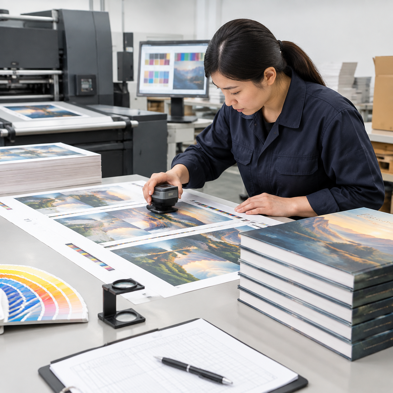
A printer maintains color consistency across an art book run by checking the job at prepress, during press production, after finishing and during final inspection. The exact control plan should be agreed before production, especially when the book contains sensitive photographs or repeat-order requirements.
Practical checkpoints
- Prepress: verify page size, profiles, image resolution, bleed, overprint, transparency, fonts and unintended spot colors.
- Make-ready: compare the first acceptable sheets with the approved proof or reference, paying attention to critical images and neutral tones.
- On-press monitoring: check density or device output, registration, gradients, solid areas and page-to-page consistency as the run proceeds.
- Finishing review: inspect whether lamination, varnish, foil or other treatments alter the perceived color, contrast or glare.
- Post-press inspection: sample finished copies for trim, binding, page order, scuffing, surface defects and color variation.
- Packing verification: confirm that the approved product is packed, labeled and separated correctly before export preparation.
Lemon Printing states that its in-house workflow covers prepress, printing, binding, finishing, quality inspection, packing and export preparation. Its four-stage quality control structure covers prepress, on-press monitoring, post-press inspection and packing verification. Buyers should still define the critical pages and acceptable visual variation in the purchase specification.
Spot colors, lamination and surface appearance
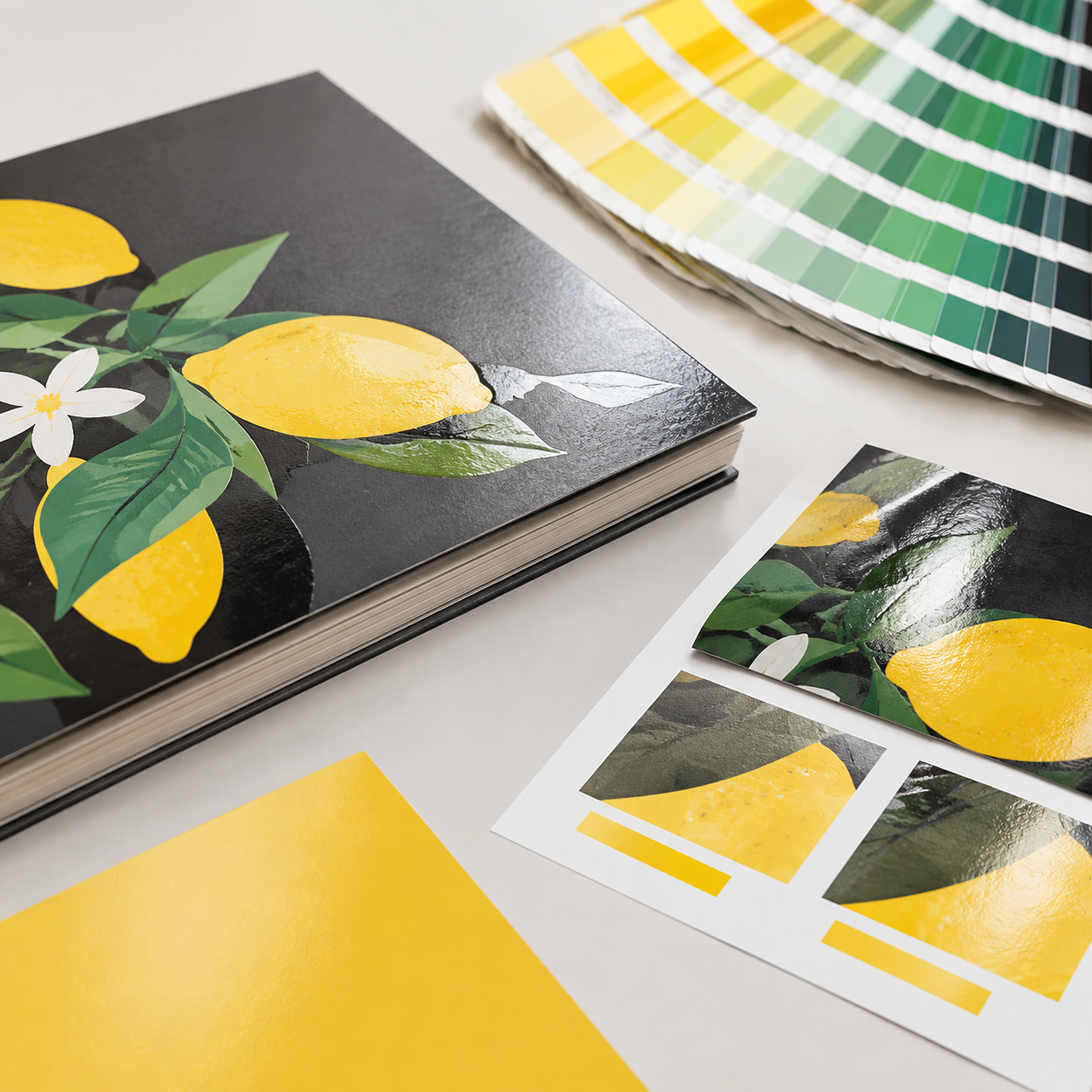
Pantone or other spot colors can be used in a book, but they should be reserved for colors that benefit from a defined spot-ink target. A spot color is a premixed ink applied separately from the standard CMYK process. It can be useful for a brand mark, a graphic accent or a color that must remain distinct from nearby process images.
Spot colors do not solve every image-reproduction problem. Photographs are normally built from process color, and converting a complex image to a spot-color system may reduce the range of tones. Ask whether the spot color will be used only for selected graphics or across a special page section. Also confirm how the color is represented in the PDF and proof.
Lamination is another appearance variable. Gloss lamination can increase apparent contrast and reflection, while matte lamination can soften reflections and change how dark colors are perceived. A coated paper, printed ink layer and laminate should be evaluated as a combination. If the cover and interior are intended to match visually, do not assume that different surfaces will produce the same result from identical color values.
What to include in an art book printing quote

A useful art book printing quote needs enough information for the printer to evaluate color, production method and finishing together. Sending only a page count and a rough size can produce an incomplete comparison between suppliers.
Include the following in the request:
- Product type and intended use, such as a photography book, artist monograph, exhibition catalog or portfolio.
- Quantity, including whether there may be a repeat order or multiple editions.
- Finished size, orientation, total page count and whether pages are supplied as single pages or spreads.
- Interior and cover paper preference, including coated or uncoated surface and approximate weight.
- Binding construction, such as sewn, perfect bound, hardcover or casebound.
- Printing method under consideration: offset, digital or a comparison of both.
- Image profile, CMYK conversion approach, intended spot colors and any brand-color references.
- Proof requirement: digital proof, printed production sheet, paper dummy or bound sample.
- Finishing details such as matte or gloss lamination, varnish, foil, spot UV or inserts.
- Delivery destination, packaging requirements and target date.
- Files or representative sample pages showing the most color-sensitive images.
Ask the supplier to separate assumptions from confirmed specifications. The quote should state what is included in proofing, whether a physical sample is available, what quality checkpoints are planned and which changes after approval may affect cost or timing. Final MOQ, production time, pricing and shipping remain dependent on the confirmed product specifications, quantity, finishing and destination.
FAQ: Color consistency in art book printing
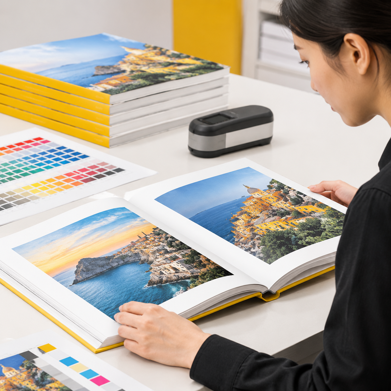
Color consistency is easier to manage when the buyer and printer agree on the reference, paper, proof and production method before the run. The questions below address common planning decisions.
Use the FAQ answers as a starting point, then confirm the details against the actual book specification.
Request a color-critical book production review
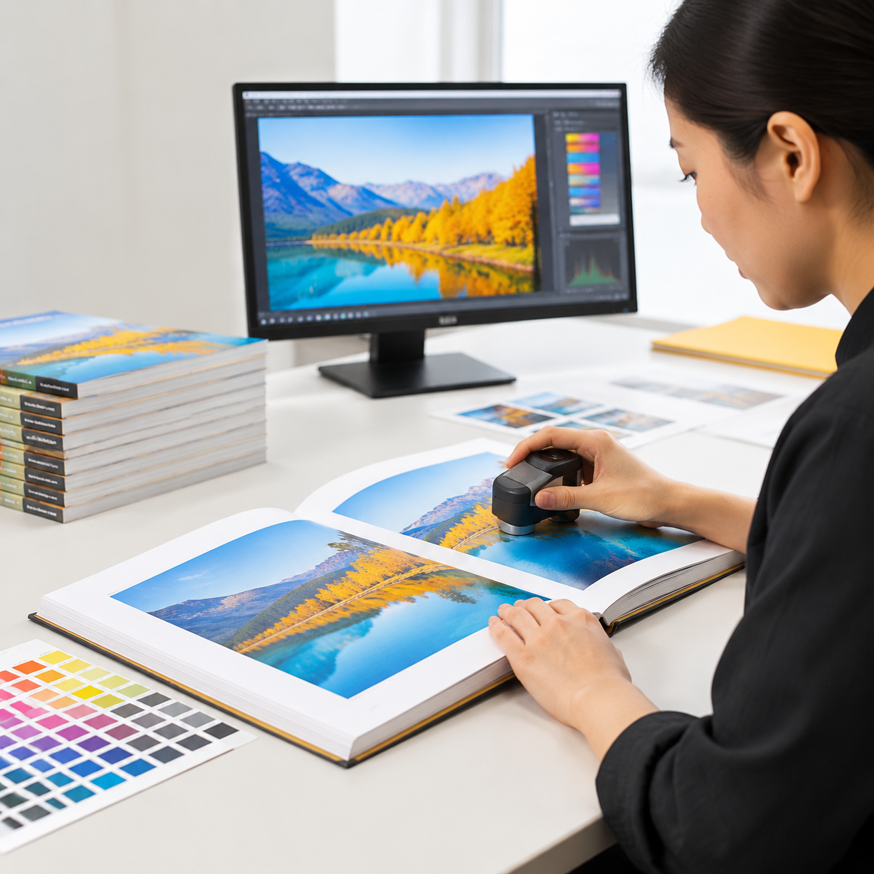
For a full-color art book, the most reliable planning step is to have the printer review the color-sensitive pages, paper choice, proofing method and proposed production process together. That review can identify assumptions before they become a press-stage problem.
Lemon Printing is a factory-backed commercial printing manufacturer established in 2015 in the Guangzhou–Shenzhen manufacturing corridor. Its self-owned facility has more than 130 skilled workers and 8+ offset and digital presses, with production stages handled in-house for international B2B orders.
Share the most sensitive images and explain what must remain consistent: neutral tones, skin tones, shadow detail, saturated artwork, brand colors or repeat-edition matching. Then ask for a specification-based recommendation rather than selecting paper or printing method from color claims alone.
Final appearance depends on the approved file, paper, proof, printing method, finishing and viewing conditions. A defined workflow can reduce surprises, but no screen-to-print process should be treated as an automatic promise of identical color.
FAQ
How do I prepare images for art book printing?
Use a documented color workflow, place images at final size, confirm the required CMYK profile with the printer, check effective resolution, review highlights and shadows after conversion, and export all pages consistently. Keep original files separate from production copies and supply representative reference pages for prepress review.
Is coated paper better for a full-color art book?
Coated paper is often useful for detailed photography and saturated artwork because its smoother surface can support crisp reproduction. Matte or silk coated paper can reduce glare, while uncoated stock creates a softer and more tactile appearance. The better choice depends on the intended look, handling and viewing environment, so compare a physical sample or proof.
What is the difference between a digital proof and a printed book?
A digital proof is primarily an approval reference for color direction, cropping and page layout. The finished book may use different production inks or toner, paper behavior, screening and finishing. A printed production sheet or bound sample can show actual production behavior more closely, but only if it uses the intended materials and process.
Should an art book use offset or digital printing?
Offset is often considered when the run is medium or large, the pages are stable and repeatability is important. Digital can suit shorter runs, test editions or changing files. The decision should also consider paper compatibility, proofing, finishing, repeat orders and the required quantity rather than quantity alone.
Can Pantone or spot colors be used in a book?
Yes. A spot color is a separately applied premixed ink and can be useful for selected brand marks, graphic accents or colors that need a defined target. Photographs are normally reproduced with process color, so spot inks do not automatically improve complex image reproduction. Confirm the spot-color setup in the PDF and proof.
How can a printer maintain consistent color across an art book run?
The printer should use a defined prepress workflow, approve a reference proof, check make-ready sheets, monitor production, inspect finishing and sample finished copies. Buyers should identify critical images and record the approved paper, profile approach, proof and finishing so future runs can be compared with the original specification.
Get a Clear Quote for Your Printing Project
Send Lemon Printing your product type, quantity, size, materials, binding or finishing requirements, delivery destination and target date. Include the page count where applicable, the paper preference, proofing requirements and a few representative color-sensitive pages. Our team will review the specifications and normally respond within one business day with practical production options, pricing and a project timeline.