Table of Contents
- Key takeaways: When to consider Pantone or CMYK printing
- What is the difference between Pantone and CMYK printing?
- Spot color and process color explained in plain language
- When should a buyer specify a spot color?
- Compare Pantone vs CMYK printing in a decision table
- How do paper, press, and finish affect the perceived color?
- Coated and uncoated stocks, lamination, and viewing conditions
- How should teams prepare files and approve color proofs?
- Color references, proof expectations, and approval records
- What should you include in a color-critical print quote?
- Frequently asked questions about Pantone vs. CMYK printing
- Discuss color requirements for your print project
Key takeaways: When to consider Pantone or CMYK printing
Pantone vs CMYK printing is a decision about how reliably a color can be reproduced and approved, not a choice between a good system and a bad one. A spot color may be appropriate for a small number of important, flat brand colors. CMYK is usually the practical starting point for photographs, illustrations, gradients, and artwork containing many colors.
- Specify a spot color when a defined brand color occupies a prominent area and the printer can run it as a separate ink.
- Specify CMYK when the job is image-heavy, uses full-color artwork, or will be produced on a digital press that simulates spot references.
- Set the paper and finishing requirements before approving color. The same ink reference can look different on coated and uncoated stock.
- For a brand-critical job, approve a calibrated proof or a physical proof on the intended stock where practical. A screen view alone is not a reliable color approval.
- Put the color system, reference numbers, paper, finish, proof type, quantity, destination, and target date in the quote request.
A Pantone reference is a useful control point, but it is not a universal promise of an identical visual result across every press, substrate, finish, and lighting condition. The same workflow matters for custom book printing, cards, catalogs, packaging inserts, and other repeat commercial materials.
What is the difference between Pantone and CMYK printing?
The difference is that Pantone printing normally identifies a premixed spot ink, while CMYK printing builds color from four process inks: cyan, magenta, yellow, and black. Pantone color printing gives the production team a named reference for a specific ink appearance. CMYK color printing creates a color through combinations of halftone dots or digital toner channels.
Short definition: A spot color is printed as a separate ink or color channel. A process color is produced by combining the four CMYK channels. On an offset press, a spot color normally needs its own separation and plate. On a digital press, a named Pantone color may instead be translated into the press color space unless the machine has a supported specialty color capability.
This distinction matters because a file that contains a Pantone swatch does not automatically mean that a physical Pantone ink will be used. The prepress team and printer must confirm how that swatch will be produced. The right question is therefore not only which color number appears in the artwork, but also which press, ink system, paper, and proof will be used to reproduce it.
Spot color and process color explained in plain language
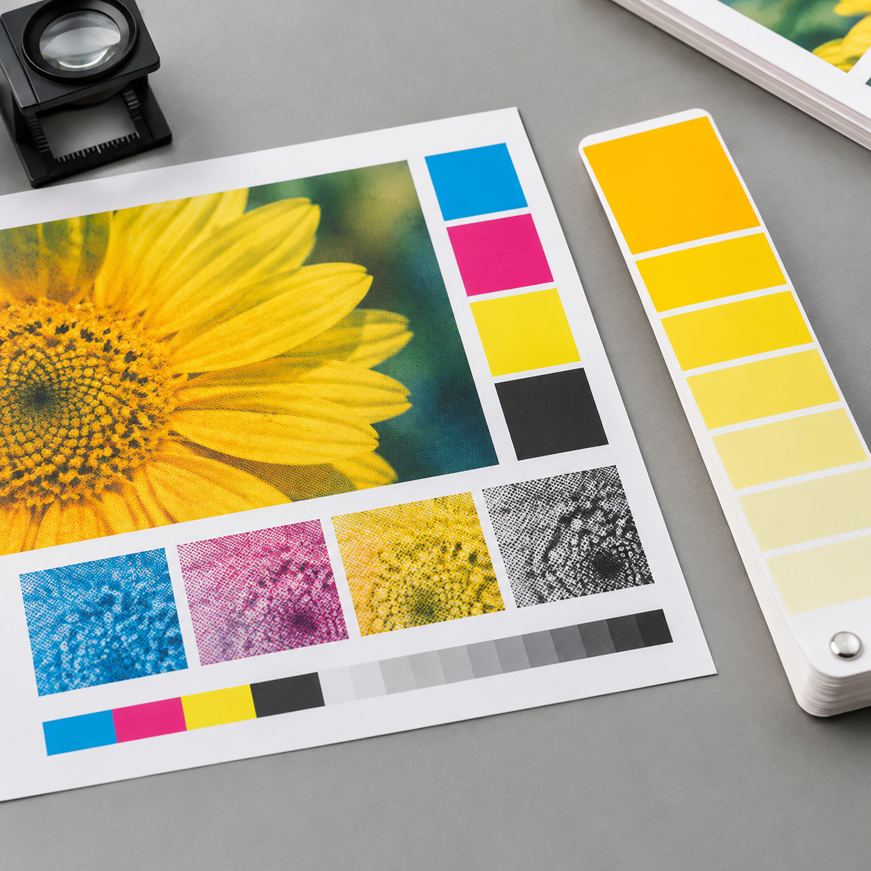
Spot color printing is like ordering a specific premixed paint, while process color is like mixing a result from four measured base inks. Neither method is automatically more accurate. Accuracy depends on the target, the material, the production method, and the approval controls around the job.
- With a spot color, the artwork identifies a separate color channel, such as a named Pantone reference. On offset production, that channel is prepared as its own plate and ink.
- With CMYK, the artwork is separated into cyan, magenta, yellow, and black. Small dots of those inks combine visually to create photographs, tints, and many other colors.
- With a mixed job, a printer may run CMYK plus one or more spot colors. This can make sense for a strict brand color alongside photographs, but it adds production decisions and may add setup complexity.
Keep the named spot swatch intact when a spot ink is intended. If the printer is expected to simulate it in CMYK, ask for the conversion method and proof expectation instead of assuming that a standard software conversion will match the printed guide. Pantone maintains its own official color resources, but a printed guide is still viewed under a particular paper and lighting condition.
When should a buyer specify a spot color?
Specify a spot color when one or two flat brand colors are highly visible, the production method supports a separate ink, and repeatability is more important than reproducing complex imagery. This is most often worth evaluating for offset jobs with broad solid areas, recurring corporate materials, or a logo color that must be checked separately from the rest of the artwork.
- Use a spot color as a starting point for a large solid logo panel, a simple brand cover, or a job with a limited color palette.
- Use CMYK as a starting point for photographs, detailed illustrations, gradients, maps, and layouts that contain many colors.
- Consider CMYK plus a spot when the job combines full-color imagery with one important brand color and the quantity and press setup justify the extra control.
- Ask before specifying a spot when the job is short-run digital, uses several different papers, or will be reordered through different production methods.
There is no universal quantity at which a spot color becomes the cheaper option. Plate preparation, ink setup, press configuration, number of colors, finishing, and total quantity all affect the quote. A photo-heavy catalog printing project will often be more naturally specified as CMYK, while a simple brand panel on a repeat offset job may justify a spot color. For a mixed-color book printing project, ask whether the cover, endpapers, or inserts need a separate color treatment rather than applying one rule to the entire product.
Compare Pantone vs CMYK printing in a decision table
Choose the method that matches the artwork and the level of color control the job actually needs. Use the table below as a specification starting point, then confirm the recommendation against the press, paper, quantity, and proof plan.
| Decision factor | Pantone spot color | CMYK process color | Buyer implication |
|---|---|---|---|
| Flat brand color | Strong fit when run as a separate ink | Can reproduce it, but the result depends on the CMYK build and profile | Use a spot reference when the solid brand area is the main risk |
| Photographs and gradients | Not sufficient by itself | Natural fit for continuous-tone and multi-color artwork | Specify CMYK for image-heavy pages |
| Number of colors | Useful for one or a few defined colors | Handles many colors through four channels | More spot colors can add setup and approval work |
| Offset production | Can use a separate plate and premixed ink | Uses four process plates | Confirm the intended separations before production |
| Digital production | Often simulated unless supported as a specialty channel | Usually the native workflow | Ask how the Pantone reference will be converted |
| Repeat orders | Provides a defined reference, but paper and press still matter | Can be consistent with controlled profiles and retained samples | Keep the approved proof and production details together |
| Paper changes | Appearance can change substantially | Appearance can also change substantially | Proof each important stock and finish |
How do paper, press, and finish affect the perceived color?
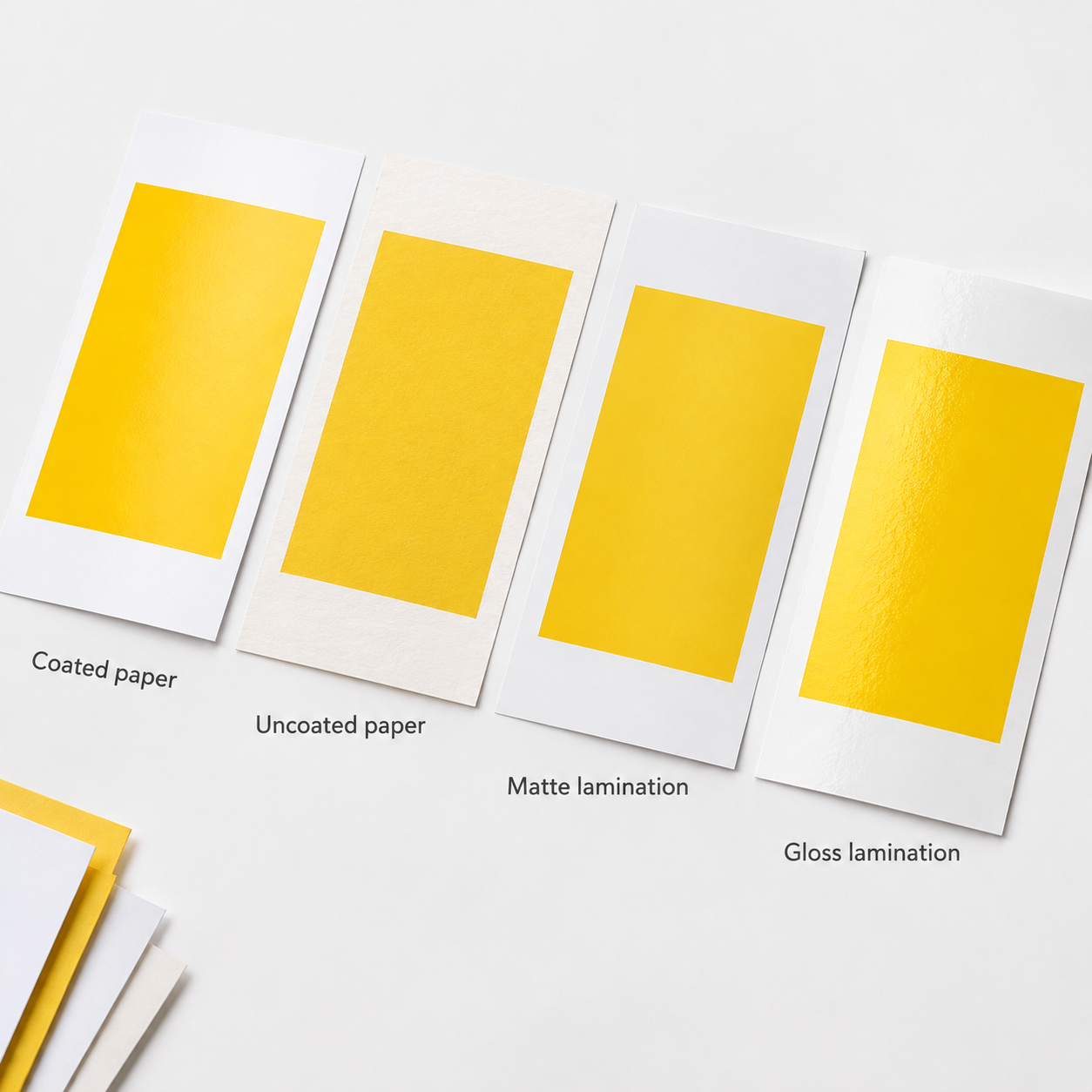
Paper, press calibration, ink behavior, and finishing can change how the same color is perceived. The color specification controls the target, but the substrate and production conditions determine how that target appears to the eye.
- Paper: Coated stock has a smoother surface that generally holds ink near the surface. Uncoated stock absorbs more ink and often produces a softer, less saturated appearance. The paper’s natural shade and brightness also influence the result.
- Press: Offset and digital presses use different ink or toner systems, screening methods, calibration routines, and color profiles. Two presses can therefore produce different results from the same file.
- Finish: Gloss lamination, matte lamination, varnish, spot UV, and textured coatings change reflection and surface contrast. A finish can make a color look deeper, flatter, brighter, or less saturated without changing the underlying artwork.
- Viewing conditions: A color viewed on a backlit monitor, under office LEDs, or in daylight may not look the same. Approval should use a defined light source and a physical reference when the color is important.
For small-format work, the chosen surface and finish are part of the color decision. Review the available card finishing options alongside the color requirement instead of approving the ink appearance first and selecting the finish later.
Coated and uncoated stocks, lamination, and viewing conditions
No, a Pantone color should not be expected to look identical on coated and uncoated paper. The coated and uncoated versions of a printed color guide represent different surfaces. A solid color that appears crisp and saturated on coated stock may look more absorbent, muted, or warmer on uncoated stock.
If the same brand identity appears on both stocks, specify the exact paper for each item and compare the appropriate coated or uncoated reference. Do not approve a coated proof and assume it settles the appearance of an uncoated insert. If a finish will be applied, review the finished sample where feasible because lamination and varnish change the way light reflects from the surface.
Viewing conditions also need a simple rule. Compare the proof and reference side by side under consistent, neutral lighting rather than switching between a monitor and a printed sheet. Many professional color evaluations use controlled lighting around the D50 daylight standard, but the buyer and printer should agree on the practical inspection condition for the project. Record that condition with the approval so a later reviewer understands how the decision was made.
How should teams prepare files and approve color proofs?

For a brand-critical job, approve a physical proof on the intended stock and finish where feasible. If that is not practical, approve a calibrated hard proof and document whether the spot color is an actual ink or a CMYK simulation. A soft proof is useful for layout and content review, but a monitor image by itself should not be the final color authority.
- Define the target. Identify each important color as a Pantone spot reference or as a CMYK value with the intended color profile. State whether the target is for coated or uncoated stock.
- Prepare the separations. Keep intended spot colors as named swatches. Check overprint behavior, black construction, transparencies, and image profiles. Ask the printer to review the file before bulk production.
- Select the proof type. Use a soft proof for content, a calibrated contract-style proof for a process-color simulation, or a physical press proof or drawdown for the highest-risk solid brand areas. Ask what the proof actually represents.
- Inspect consistently. Compare the proof with the approved reference under agreed lighting. Check large solid areas, small logo details, reverse type, photographs, and any color next to a finish.
- Record approval. Save the approved proof, file version, paper, finish, color references, inspection condition, approver, and date. Email approval without identifying the exact version is difficult to manage later.
- Verify production. Confirm that the approved specification reaches the press and finishing teams. Review retained samples or first sheets when the project requires it, then inspect the finished product for surface and color changes.
Lemon Printing handles prepress, printing, finishing, quality inspection, and packing in its self-owned facility. Its production controls include prepress review, on-press monitoring, post-press inspection, and packing verification. That in-house sequence helps keep the approved color information with the job, but it does not remove the need for a clear buyer approval. The commercial printing process should be discussed together with the proof plan.
Color references, proof expectations, and approval records
A usable approval record connects the color target to the exact production conditions. It should be specific enough that a different member of the buying or production team can understand what was approved without relying on a screen capture.
- Color target: Pantone reference and coated or uncoated designation, or CMYK values with the supplied profile.
- Artwork status: Final file name, revision date, named spot swatches, and confirmation that unwanted spot colors have not been converted or left in the file.
- Substrate: Paper type, weight, coated or uncoated surface, natural shade, and any special texture.
- Finish: Lamination, varnish, spot UV, foil, embossing, or other treatment that may change reflection and perceived color.
- Proof basis: Soft proof, calibrated hard proof, press proof, or physical sample; note whether the spot color is simulated.
- Acceptance record: Proof identification, inspection light or condition, approver, date, and any agreed tolerance or visual caveat.
- Repeat-job reference: Previous job number, retained sample, press information, and any approved changes to paper or finishing.
For repeat production, retain the approved physical sample with the purchase record where possible. A sample is not a substitute for a specification, but it gives the printer and buyer a shared reference when the next order is reviewed.
What should you include in a color-critical print quote?
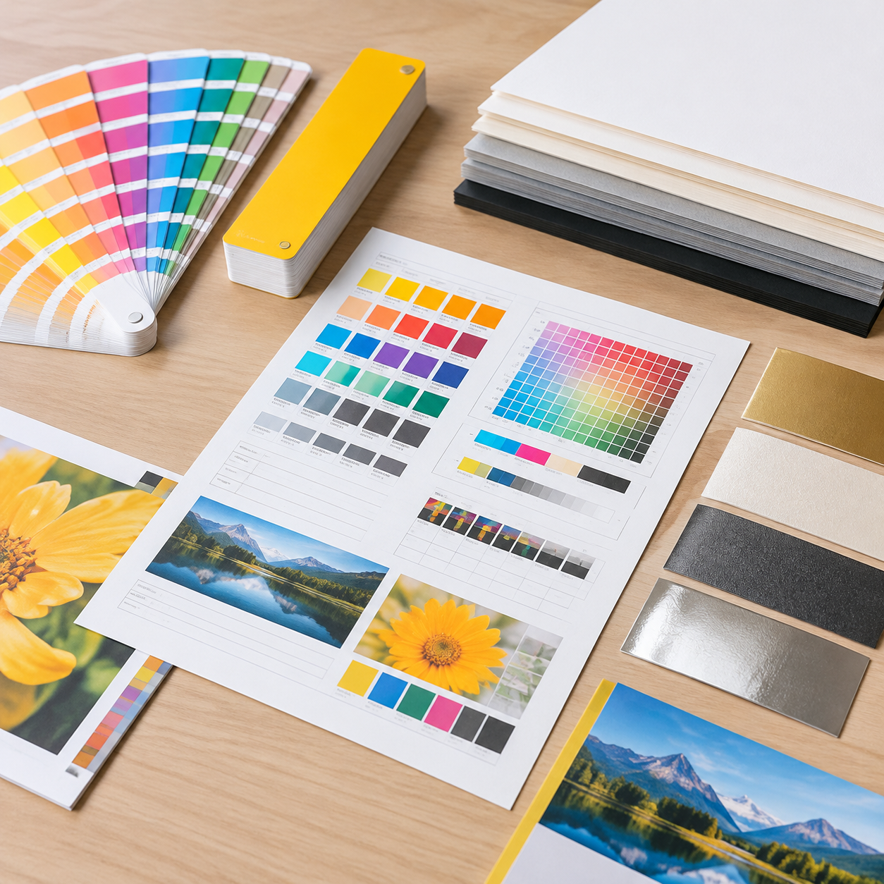
A color-critical quote should describe the color target and the conditions that will be used to reproduce it, not just state that the job is full color. Send the printer enough information to compare a spot-color route, a CMYK route, or a mixed route on the same basis.
- Product and application: State whether the job is a card, brochure, catalog, book, insert, label, ticket, or another product, and explain where the brand color will appear.
- Quantity and size: Provide quantity, finished size, page count where applicable, and whether there are multiple versions or languages.
- Color coverage: Identify 4/0, 4/4, spot-only, or CMYK plus named spot colors. In this notation, 4/4 means full color on both sides.
- Color references: Provide Pantone numbers with the coated or uncoated designation, or CMYK values and the intended profile. Include an approved printed sample for a repeat project.
- Materials and finish: State paper type and weight, coated or uncoated surface, lamination, varnish, spot UV, foil, embossing, or other finishing requirements.
- Proof expectation: Request a soft proof, calibrated hard proof, physical proof, or press sample, and ask whether a Pantone color will be printed as a spot ink or simulated.
- Quality and delivery: Provide the acceptable visual target, inspection requirements, delivery destination, shipping preference if known, and target date.
Lemon Printing can review these details as part of its quality planning, including prepress, on-press, post-press, and packing checkpoints. Its four-stage quality control is most useful when the buyer’s approved color and material specifications are clear. Final MOQ, production time, pricing, and shipping depend on product specifications, quantity, finishing, and destination.
Frequently asked questions about Pantone vs. CMYK printing
These questions cover the decisions most likely to change a color-critical print specification: the ink method, paper, proof, and information supplied to the printer.
Discuss color requirements for your print project
Brand color consistency comes from a controlled specification and approval record, not from choosing a Pantone number in isolation. Select spot color, CMYK, or a combination based on the artwork, press, paper, finish, quantity, and repeat-order needs. Then approve the right proof and keep the approved conditions with the production file.
For the clearest result, make the color requirement part of the original print brief. A printer can then explain whether the reference will be printed as a physical spot ink, simulated in CMYK, or managed through a calibrated digital workflow, and what proof is appropriate for the risk.
FAQ
What is the difference between Pantone and CMYK printing?
Pantone printing normally identifies a premixed spot ink, while CMYK printing builds color from cyan, magenta, yellow, and black process inks. A Pantone reference can be printed as a separate offset ink or simulated through a digital press workflow, so confirm the actual production method with the printer.
When should I use a spot color instead of CMYK?
Use a spot color when a small number of flat brand colors are highly visible and the press can run them as separate inks. CMYK is usually more practical for photographs, gradients, detailed illustrations, and jobs with many colors. A mixed CMYK plus spot-color setup may suit artwork that combines both requirements.
Will a Pantone color look identical on coated and uncoated paper?
No. Coated and uncoated paper absorb and reflect ink differently, and the paper shade also affects the perceived result. Use the appropriate coated or uncoated reference and approve a proof on the actual stock when the color is important.
What proof should I approve for a brand-critical print job?
Where feasible, approve a physical proof on the intended paper and finish, or a press proof or drawdown for a high-risk spot color. If that is not practical, use a calibrated hard proof and document whether the spot color is simulated. A soft proof is useful for layout but should not be the only color approval.
What color information should I provide when requesting a printing quote?
Provide the product, quantity, finished size, page count where applicable, color sides, Pantone references or CMYK values and profile, coated or uncoated paper, finishing, proof expectation, delivery destination, and target date. Also state whether the Pantone reference must be printed as a spot ink or may be simulated. Final MOQ, production time, pricing, and shipping depend on the complete specification.
Get a Clear Quote for Your Printing Project
Send Lemon Printing your product type, quantity, finished size, page count where applicable, materials, color requirements, binding or finishing requirements, delivery destination, and target date. Our team will review the specifications and normally respond within one business day with practical production options, pricing, and a project timeline. Final MOQ, production time, pricing, and shipping depend on product specifications, quantity, finishing, and destination.