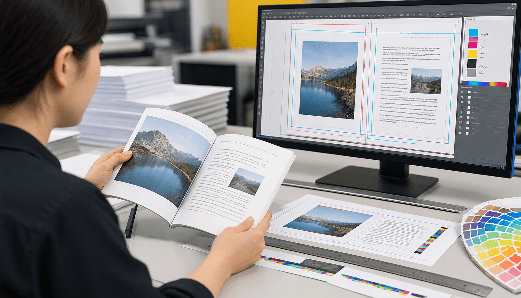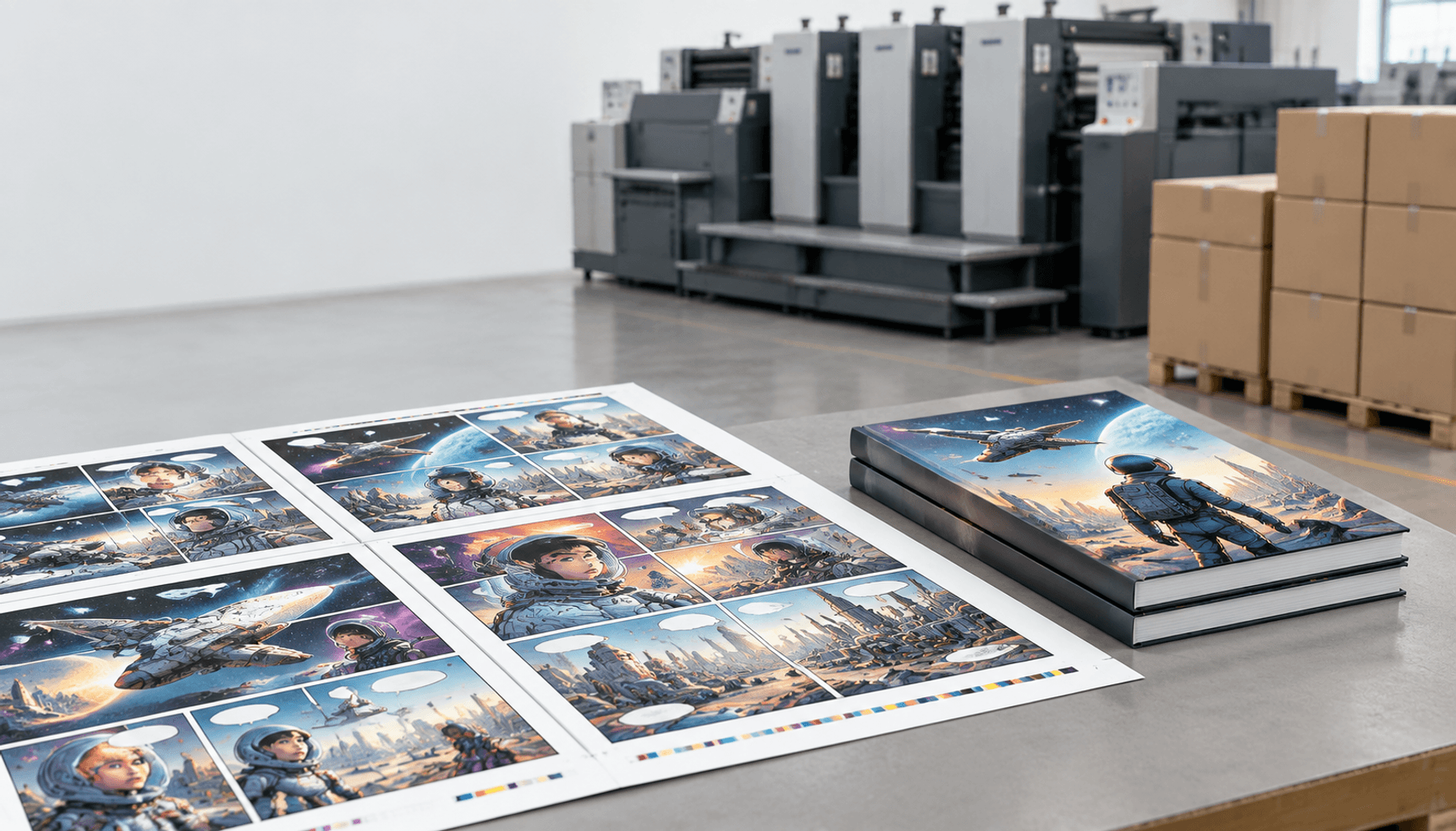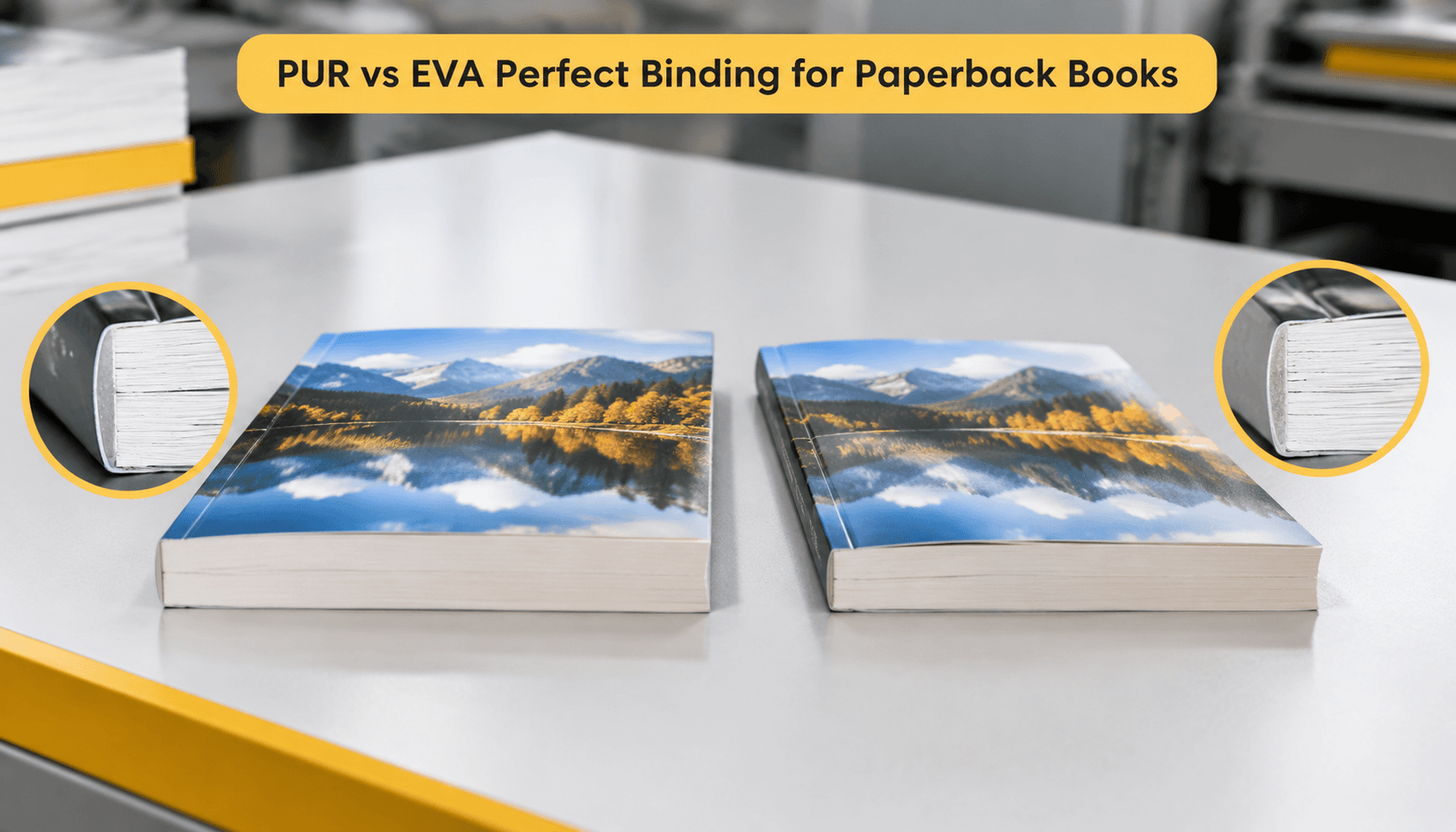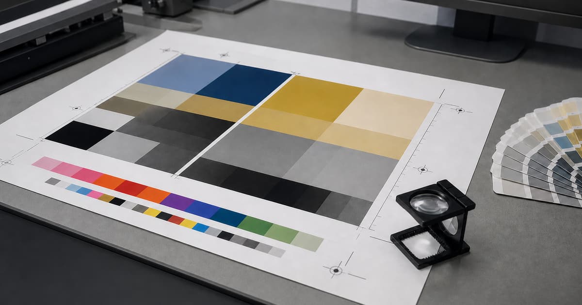
Print-ready artwork is a clear, reviewable instruction set for the finished product. It helps prepress identify trim, color, images, fonts, and finishing requirements before a job enters production. Project specifications remain the authority: dimensions, file settings, layers, and proof expectations vary with the product and process.
Prepare the file early, then preflight it again after every late change. A polished layout can still produce avoidable questions if an image is linked incorrectly, a spot color is unnamed, or a dieline is mixed into printable artwork. The aim is a dependable hand-off with enough context to review the work intelligently.
Build the PDF around the finished product
Start with the agreed trim size, orientation, page count, and reading order. Export single pages or spreads only as requested for the product; a booklet, a folded piece, and a bound book can need different delivery conventions. Include intentional blank pages, check that covers are separate when required, and keep the source document with its linked assets until the job is complete.
Check effective resolution at placed size
Effective resolution is determined by the image data in relation to its final placed dimensions. An image can look convincing on a screen and still lose detail when enlarged in the layout. Inspect the exported PDF as well as the working file, looking for soft imagery, unexpected crops, compression artifacts, or a placed image that was scaled beyond its useful detail. Use the project guidance for the required resolution rather than a remembered setting from another job.
Where an image crosses a fold, spine, die-cut, or trim, review the composition in the final product context. A subject placed safely in a flat layout may be interrupted once the item is constructed. Flag any deliberately close crop for proof review so it is judged against the selected binding or fold instead of only against the screen layout.
Common starting points—job specification overrides
| Prepress item | Common starting point | What the job specification decides |
|---|---|---|
| PDF delivery | Use a controlled PDF export; PDF/X variants are common delivery standards. | The requested PDF/X variant, page convention, output intent, and any supplied preset. |
| Bleed | Three millimetres is a common example for a trimmed printed item. | The required bleed and safe area for the actual format, fold, binding, or finishing. |
| Images | Check effective PPI at final placed size. | The required resolution and any exception for the chosen process or product. |
| Color and black | Use process and spot colors deliberately; use vector artwork where possible for logos and small type. | The profile, spot-color naming, black build, and proof method accepted for the job. |
For example, a 3,000-pixel-wide image placed at 10 inches wide has an effective resolution of 300 PPI: 3,000 ÷ 10 = 300. If the same file is placed at 15 inches, it becomes 200 PPI. This is a planning calculation, not a universal acceptance threshold; the project specification and intended viewing distance decide whether that result is suitable.
When RGB artwork is converted to CMYK, use the profile and conversion path requested for the job and inspect the resulting PDF rather than assuming colors will translate unchanged. Keep logos and very small type as vectors when possible so they remain defined at output. For black text, 100K is often used for small type; large rich-black areas may use a different build, but only the agreed production specification should determine it.
Set color with an agreed intent
Use the requested CMYK workflow for process-color artwork. When a design depends on a spot color, name it consistently and keep it distinct from process content. A screen preview is not a production proof: paper, ink, coating, lighting, print method, and finishing all influence appearance. The useful instruction is what must be reviewed and against which approved reference.
Flag brand-critical colors, large solids, fine reversed type, and the images that carry the greatest importance. If an approved physical sample or color reference exists, supply it with the brief and state its purpose. The print quality guidance can help turn a broad color concern into specific proof questions. Keep any special color or white-ink layer visible to the reviewers who need to approve it.
Protect trim, bleed, and safe areas
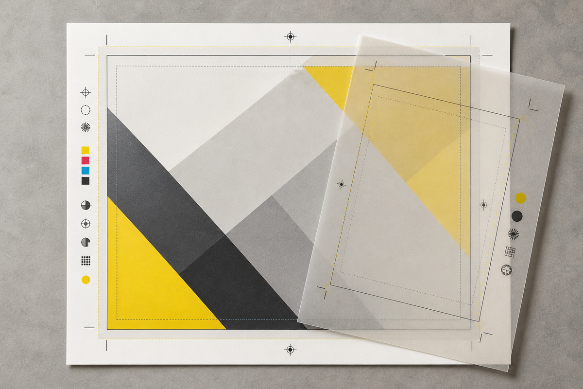
Bleed extends backgrounds or images beyond final trim so normal cutting variation does not leave an unintended edge. Safe areas protect essential type, logos, and fine details from trim, folds, holes, and binding. Use the dimensions supplied for the finished product rather than copying them from an unrelated file.
For cartons, shaped cards, pockets, or special folds, use the supplied dieline rather than recreating it. Keep it on the agreed non-printing layer or spot-color convention and separate it from the printable design. Check every panel for text or image elements that cross a fold, spine, punch, or cut path. The card printing options page is useful context when a flat layout will be cut or scored into a constructed item.
Control type, transparency, and overprint
Embed fonts or convert them only when the agreed workflow calls for it, then inspect the final PDF for substitution or reflow. Small type, thin rules, reversed copy, and text over images deserve close attention because they are more sensitive than a large headline. Keep the final text proof separate from a visual color review so each approval question is clear.
Transparency, blend modes, knockouts, and overprint can be intentional but should be checked in the exported PDF. An overprint setting that gives one object a desired result can make another disappear or combine unexpectedly. Use output-preview tools where available and identify anything unusual in the hand-off. This includes metallic effects, varnish, white ink, or other finishing layers that must be produced independently from the ordinary artwork.
Keep the production PDF distinct from working proofs that contain comments, guides, or alternative concepts. Remove accidental hidden objects, unused swatches, review notes, and obsolete layers before export, while preserving the agreed production layers that prepress needs. Open the final exported file in a separate viewer. This catches stale links and export settings that may not be obvious inside the design application.
Separate finishing instructions from printable art
Only include a dieline, white ink, foil, emboss, varnish, or other finishing layer when the product specification calls for it. Name the layer according to the project convention and make its relationship to the visible design clear. Do not invent extra production marks in a final PDF. A short note identifying the intended effect and the pages it affects is more useful than relying on a reviewer to infer it from a complex file.
Preflight the final export, not just the source
- Confirm final trim, orientation, page count, pagination, bleed, and safe areas.
- Inspect effective image resolution and crops at the final placed size.
- Review CMYK, spot colors, black builds, and color-critical pages.
- Verify fonts, transparency, overprint, folds, dielines, and finishing layers.
- Compare the PDF with the written specification before the release is approved.
Preflight works best as a sequence. First check the document structure, then inspect output warnings, then review representative pages visually, and finally compare the exported PDF with the job brief. A second person can focus on page order, live text, and unexpected objects while the designer checks color intent and layout. Record the version that passed so a later edit triggers a targeted repeat of the same checks.
For a multi-page job, make a page-by-page exception list rather than relying on memory. Note pages with a special fold, a different stock, a critical image, a finishing layer, or a language version. The list helps the approver concentrate on real risks and gives production a concise explanation of why those pages deserve additional attention during preflight and proof review.
Do a final filename check as well. The file name should distinguish the approved production version from drafts without making a promise about an unverified method, date, or outcome. Match the named file to the quote, product specification, and approval record. If anything changes after release, issue a clear replacement and state exactly which prior file it supersedes.
Release files with production context
Send the final PDF together with the product specification, quantity, named approver, proofing request, and delivery requirements. Tell production about anything deliberately unusual: a special ink, die-cut, fold, insert, versioned file, or finishing layer. For a bound publication, connect the file review to the book production brief, including cover and interior page-count details.
Useful links for a complete hand-off include the production process for the approval sequence and the coated versus uncoated paper guide for stock implications. Use the artwork review contact page for product-specific questions before files are locked. The correct result is not an abstractly perfect PDF; it is an approved file that accurately describes the product being made.