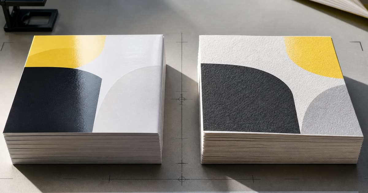
Coated and uncoated paper do different jobs. Neither is automatically better: the right choice depends on what readers need to see, touch, write on, carry, and keep. Choosing early also helps a printer assess page thickness, binding, color expectations, and finished shipping weight.
Begin with the product and its use. A catalog, greeting card, teaching workbook, and calendar may all use full color, yet each places different demands on surface, opacity, and durability. Order or review samples beside representative artwork whenever the decision is important.
Understand surface and ink behaviour
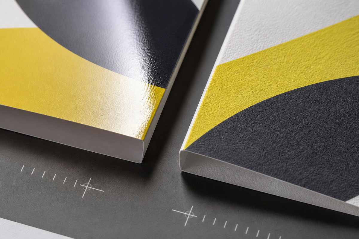
Coated papers have a treated surface that is commonly smoother than uncoated stock. That surface can help fine image detail, solid color, and crisp graphic shapes appear more defined. Gloss, silk, and matte coated papers also change glare and tactile feel, so “coated” is not a single visual outcome.
Uncoated paper has a more open, paper-like surface. Ink interaction, texture, and perceived softness can be different from a coated sheet. It can suit text-led work, stationery, journals, or designs that benefit from a natural feel. The artwork still matters: large solids, delicate type, and photographic images should be judged on the proposed stock rather than assumed to behave alike.
Use GSM as one part of the specification
GSM describes grammage, or paper weight per square metre. It is helpful, but it does not tell the whole story. Two sheets with similar GSM can differ in thickness, stiffness, opacity, shade, coating, and bulk. Those differences influence a book spine, folded card, calendar page, and the finished parcel.
Specify the intended role for each component: cover, text page, divider, insert, backing board, or envelope. Then ask whether the chosen sheet gives the required opacity and handling. For a publication, paper selection affects page turn, show-through, and binding; the book printing options page provides a useful format context before finalising stock.
Check opacity, writing, and finished weight
Opacity is the resistance to show-through. It matters when both sides of a sheet carry strong color, fine text, or a dark image. A thin, opaque sheet may suit one project while a bulkier sheet makes another feel more substantial. Ask to assess it using your actual page design, particularly where text and photographs meet on opposite sides.
Writing performance is equally practical. Pens, pencils, stamps, and markers interact with paper differently. If users will annotate, test the intended writing instrument and allow for drying, show-through, and the desired amount of texture. A surface that makes a photo look sharp may not be the best writing surface for a notebook or form.
Finished weight is the accumulated result of size, page count, paper, cover, binding, and packaging. Treat it as a design constraint, not a late freight surprise. It affects mailability, cartons, handling, and distribution. A small change repeated across many pages can materially alter the finished product.
Consider caliper, grain, and folding
Caliper is the measured thickness of a sheet. It is related to GSM but is not interchangeable with it: papers with similar grammage can build to different thicknesses. In a bound publication that difference can affect spine calculation, stiffness, and how a stack sits in a carton. For a folded piece, thickness can influence the fold and the way panels align. Give the printer the intended final construction, not only a target GSM.
Grain direction is another physical property worth raising when sheets will be folded, scored, or bound. A fold that works cleanly with one grain direction can behave differently with another, particularly on heavier or coated stocks. Ask which direction is proposed for the finished size and whether scoring, folding, or a dummy is advisable. This is a production question, not a cosmetic detail, and it should be resolved before artwork is locked to a fold pattern.
Ink and drying behaviour should be evaluated as part of the material decision. Coverage, coating, dark solids, and finishing can influence handling between printing and later steps. Rather than predicting a result from a sample label, share the heaviest page and any finish that will be applied. Production can then identify whether the proof and schedule should allow for additional checking or handling time.
Match the stock to the product
| Product need | Questions to ask |
|---|---|
| Image-led book | How should photographs, glare, page turn, and book weight balance? |
| Card or invitation | Does the design need a smooth printed surface, a tactile finish, or handwriting space? |
| Calendar | Will pages be viewed under light, written on, or turned frequently? |
| Journal | Which pens will users use, and how much show-through is acceptable? |
For promotional pieces, review the requirements alongside card printing formats. For date-led campaigns, consider how the image surface and writing experience fit the calendar printing project. Journals and workbooks often need an explicit writing test; notebook and journal printing can help anchor that conversation.
Evaluate samples with a repeatable method
Samples are most useful when each reviewer assesses the same things. Place them under the lighting where the product will be used, compare them with representative printed pages, fold or bind a dummy if construction matters, and write on them if the reader will. Note observations rather than relying on labels such as premium or high quality.
Evaluate a sample in the sequence a reader will experience it. First look at images and text from normal viewing distance; then tilt the page to notice glare, sheen, texture, and show-through; finally fold, turn, write on, or place it in the intended packaging. Compare the same artwork on each candidate sheet. If reviewers disagree, record the decision criterion that matters most, such as writing comfort, photographic detail, low glare, or manageable shipment weight.
A proof is more informative when it includes difficult content: a dark image opposite small type, a large solid, a pale tint, and a writing area where relevant. Mark which results are essential and which are preferences. This keeps a paper selection discussion grounded in use, and gives the printer a clear basis for suggesting a practical alternative if the preferred stock is unavailable or unsuitable for the construction.
- Compare image detail, solid color, glare, and paper shade.
- Check reverse-side show-through on your darkest pages.
- Handle folded, bound, or punched samples as the finished product will be used.
- Test writing tools, drying, and erasing where relevant.
- Record the selected stock and any acceptable alternatives in the quote request.
Turn the decision into a better quote
Send the size, page count, quantity, color plan, product use, preferred paper, cover requirements, binding, finishing, and delivery destination. If you are open to alternatives, explain what must not change: writing performance, image reproduction, target feel, or finished weight. Attach sample pages that include the most demanding images and the smallest type.
Also identify the test that will decide the choice: a signed sample, a proof review, a writing trial, or a constructed dummy. Tell reviewers whether the selected sheet must match a particular sample or simply meet a stated use requirement. This turns subjective terms such as smooth, substantial, or natural into a reviewable production instruction.
Use the print quote contact page to share the brief and ask which paper choices are practical for the proposed product. The best comparison is not coated versus uncoated in the abstract; it is which sheet supports your readers, artwork, and distribution plan.