Table of Contents
- CMYK vs Pantone for board books: Which color approach fits the artwork?
- Define process colors, spot inks, and Pantone references
- Understand simulated Pantone colors and dedicated spot inks
- Comparison table: Artwork suitability, proofing, production inputs, and reprints
- How facing paper and surface finish change color appearance
- Evaluate printed paper before mounting and the completed board book
- Set a physical color reference and agreed viewing conditions
- Five steps to prepare separations and approve color
- What digital proofs and physical samples can validate
- Quote checklist for process-color and spot-color board books
- Lemon Printing color and prepress options for board books
- FAQ: CMYK, Pantone references, and board book color approval
CMYK vs Pantone for board books: Which color approach fits the artwork?
Use CMYK for photographs, painted illustrations, gradients, and artwork containing many shades. Consider dedicated spot inks for a limited palette or a critical solid color, and combine both when illustrations need a separate brand-color ink. Choosing CMYK vs Pantone for board books starts with identifying which colors require specific control.
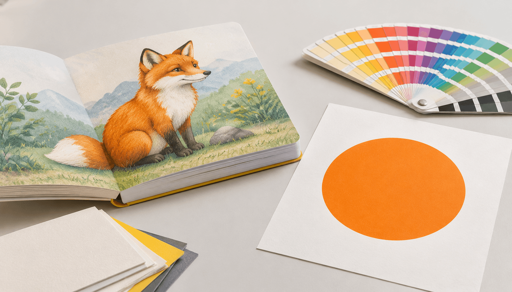
A fox character with textured fur, highlights, and shadows usually fits CMYK. A flat orange publisher mark repeated beside that character may justify a dedicated ink. Making the entire character a spot color requires deliberately rebuilding its separations; adding a Pantone name to an orange swatch does not accomplish that.
The decision also depends on the facing paper, surface finish, approval reference, and repeat-order requirements. Agree on those inputs before treating an attractive screen image as the production target.
Define process colors, spot inks, and Pantone references
CMYK describes a four-ink printing system. Pantone provides standardized color references; it does not, by itself, specify how a book must be printed.
- CMYK process colors
- Cyan, magenta, yellow, and black inks create other colors through overlapping patterns of small dots called halftones. These four inks can reproduce many colors within the limits of the printing condition.
- Spot ink
- A separately mixed ink printed as its own separation. In offset printing, it uses its own plate. It can print solid areas or screened tints.
- Pantone reference
- A named color target from a specified Pantone system and guide. The C and U suffixes identify coated-paper and uncoated-paper references; neither describes the finished laminated board book.
- Color separation
- The artwork assigned to each printing ink. CMYK plus one spot normally means five ink separations wherever all five are required.
Understand simulated Pantone colors and dedicated spot inks
Specifying a Pantone color does not automatically mean spot color printing. The supplier may reproduce it using CMYK unless the order and production files explicitly require a dedicated ink.
For a simulation, a color conversion produces a CMYK build: percentages of the four process inks intended to approximate the reference. Some Pantone colors fall outside the achievable CMYK range on the chosen paper. Conversion settings also affect the result, so a CMYK recipe copied from a design application is not a universal match.
For a dedicated spot, identify the Pantone reference, preserve the named separation, and specify where it prints. Compare these instructions: Pantone reference for CMYK simulation and CMYK plus one dedicated spot ink. They describe different production requirements. Even a separately mixed ink needs approval on the intended paper and finished surface.
Comparison table: Artwork suitability, proofing, production inputs, and reprints
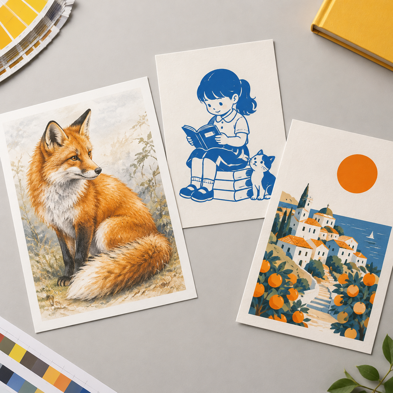
CMYK is usually the practical starting point for full-color illustration. Dedicated spots suit deliberately limited palettes, while a combined approach keeps process artwork and selected solid colors under separate control.
| Decision factor | CMYK | Dedicated spot inks | CMYK plus spot |
|---|---|---|---|
| Artwork suitability | Photographs, shaded characters, gradients, and varied palettes. | Flat graphics and artwork designed around named inks and their tints. | Illustrated spreads with a separately controlled logo or recurring solid element. |
| File preparation | Four process separations using the agreed output profile. | One named separation per ink; remove unintended process colors. | Preserve process artwork and named spot separations together. |
| Color proofing | Profiled proof for process appearance; confirm finished-surface effects. | Ink drawdown or relevant press sample; screen previews are insufficient. | Process proof plus spot-ink approval and interaction checks. |
| Production inputs | Four process inks, plate layout, paper, and finish. | Ink preparation, plates, paper, finish, and registration requirements. | Additional separation and a compatible printing unit or planned pass. |
| Repeat-order records | Approved files, profile, material specifications, and retained samples. | Named references, recorded ink formulation, materials, and retained samples. | Both sets of records, including where the spot ink is used. |
CMYK board book printing and spot printing do not have a universal price relationship. Two spot inks involve different inputs from four process inks; adding a spot to CMYK introduces further setup. Plates, printed sheet layouts, coverage, quantity, and proofing requirements all affect the quote.
How facing paper and surface finish change color appearance
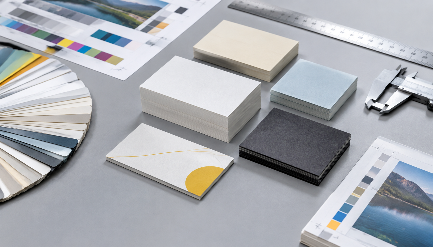
Board book color printing depends on the paper carrying the image and the surface viewed by the reader. The same ink specification can appear different after a paper or lamination change.
In many board books, printed facing paper is bonded to a thicker board core. Specify its grade, weight, white shade, coating, and opacity separately from the core thickness. Paper whiteness changes the background beneath the inks; absorption and surface properties affect how printed dots reproduce. A darker core can influence appearance if the facing paper has insufficient opacity.
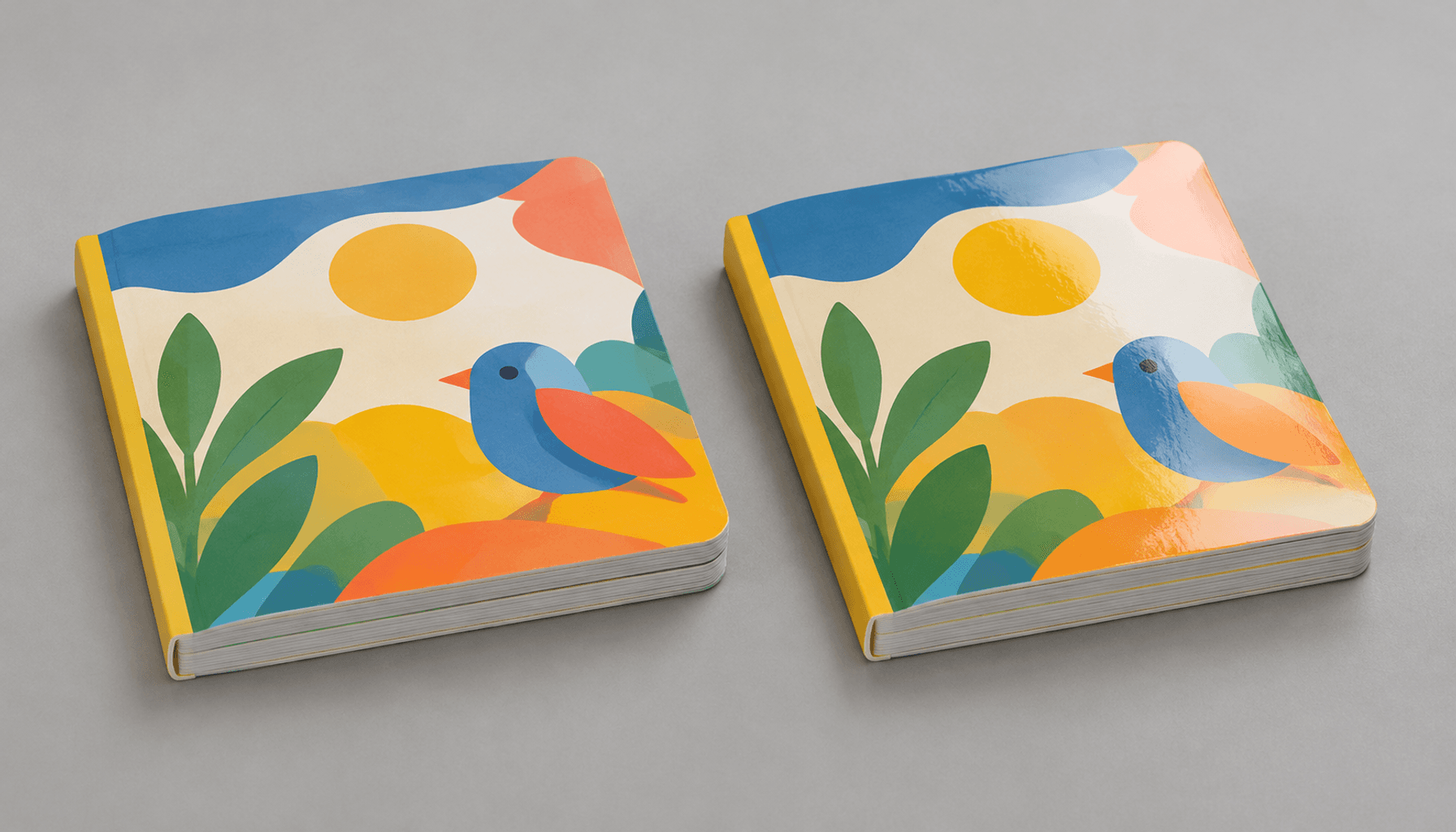
Gloss lamination can make colors appear deeper while creating reflections. Matte film may soften perceived contrast, although the effect depends on the film and paper. Approve the actual material combination. A bare coated-paper swatch does not establish how the laminated page should look.
Evaluate printed paper before mounting and the completed board book
Inspect the printed sheet to assess printing, then inspect a finished sample to assess the appearance the buyer will receive. Each checkpoint answers a different question.
Before mounting, compare critical solids, neutral areas, small reversed text, and colors crossing adjacent panels. Check registration, meaning alignment between ink separations, and look for uneven ink coverage. Judge color after the relevant drying period because freshly printed ink can change appearance as it dries.
On the completed book, check the same colors through the specified finish and compare neighboring pages together. Confirm that mounting, opacity, or surface differences have not introduced visible changes. Retaining both an approved printed sheet and a finished sample helps identify whether later variation came from printing or subsequent materials and finishing.
Set a physical color reference and agreed viewing conditions
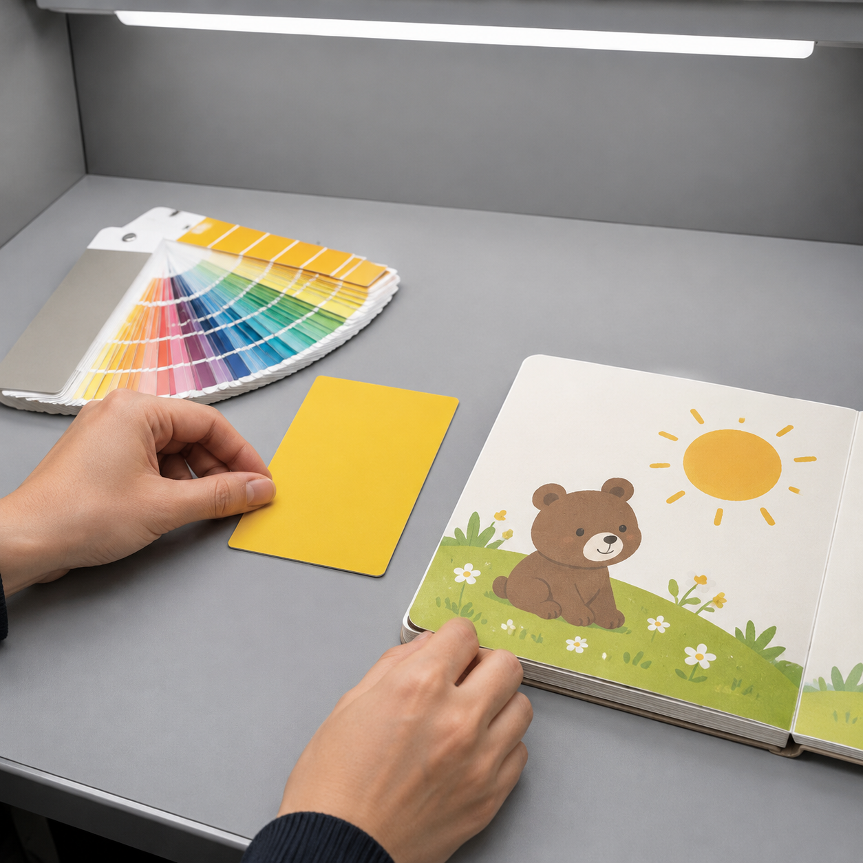
Pantone color matching needs an identified physical target and a repeatable viewing method. Establish whether the Pantone guide, approved ink sample, or finished-book sample governs acceptance, and document any approved departure from the original reference.
Compare samples under controlled D50 viewing light, a standardized daylight condition around 5000 K, with a neutral surround. Avoid mixing window light with office lighting. Agree on viewing angle for glossy surfaces. Two samples that look similar under one light source can separate under another.
For measured print color tolerances, specify the target patches, instrument settings, backing, and whether measurements apply before or after finishing. Delta E 2000, written as ΔE00, expresses measured color difference; lower values indicate a closer measured match. There is no single suitable limit for every board book. Set achievable criteria with the printer, and review illustrations and neighboring pages visually as well. A solid patch measurement alone does not approve an entire spread.
Five steps to prepare separations and approve color
Agree on the color strategy before exporting production files. Then check the actual separations and approve references that represent the chosen inks, paper, and finish.
- Map the color priorities. Identify photographs, shaded illustrations, critical solids, and recurring characters. Mark where a specific color must remain consistent. Decide whether that requirement applies to the cover, selected spreads, or every printed sheet layout.
- Agree on conversion and ink names. Obtain the intended CMYK output profile and conversion instructions. For spots, use one consistent name per intended ink and record the Pantone system, number, and suffix. Do not convert approved spot separations to process during export.
- Inspect the production PDF. Toggle individual separations to confirm that each object prints with the intended inks. Check overprint settings, which determine whether inks overlap or knock out underlying artwork. Agree on traps, the small overlaps used to prevent visible gaps from registration movement.
- Select the approval evidence. Confirm what the process-color proof represents and how the spot ink will be evaluated. Where finished appearance matters, arrange a relevant laminated sample. Document the reference hierarchy, viewing conditions, and acceptance criteria before approving color.
- Record the release and retain samples. Identify the approved file version, proof or sample, ink specification, facing paper, and finish in writing. Record exceptions explicitly. Keep matched samples with the buyer and printer, protected from light and damage, for repeat-order comparison.
Coordinate these checks with the printer’s artwork preparation and production process so the approved files and production instructions agree.
What digital proofs and physical samples can validate
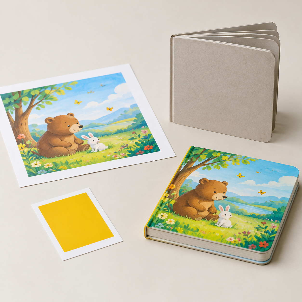
A proof validates only the conditions it represents. A physical proof may use different ink or paper from production, while a structural dummy may contain no meaningful color evidence.
- PDF or screen proof: Useful for content, placement, page sequence, and reviewing separation intent with appropriate software. Its displayed color depends on the monitor and viewing setup; it cannot establish finished-board-book color.
- Profiled hard-copy proof: Useful for evaluating CMYK appearance within a defined printing condition. Ask which profile it simulates. A displayed spot color may be an approximation, especially when outside the proof device’s color range.
- Spot-ink drawdown: A controlled application of ink to paper, useful for assessing a solid color on the intended stock. It does not establish registration, screened tints, full-layout behavior, or laminated appearance unless those conditions are specifically represented.
- Press sample or finished sample: Can evaluate actual ink and paper interactions when made with the intended materials and process. A finished sample also shows surface effects. Confirm whether it represents production conditions or only construction.
Record whether each approval covers content, color, construction, or finish. If a sample lacks the specified lamination, leave finished-surface color approval open. Lemon Printing’s proof approval and print quality controls provide a useful starting point for discussing project-specific checks.
Quote checklist for process-color and spot-color board books
A comparable quote needs an explicit ink specification and approval plan alongside the book’s physical specifications. A Pantone number alone leaves important production questions unanswered.
- Book specification: Product type, quantity, finished size, page count, and how printed surfaces are counted.
- Materials and construction: Facing paper grade and weight, white shade, core material and thickness, binding or assembly, and surface finish.
- Ink requirement: CMYK, named spot inks, or both; identify which covers, spreads, or printed sheet layouts require each ink.
- Color references: Pantone system, number and suffix, physical reference condition, approved samples, and CMYK profile where applicable.
- Proofing scope: PDF review, process-color proof, ink drawdown, press sample, or finished sample; specify what each must validate.
- Acceptance criteria: Critical areas, agreed viewing conditions, visual limits, and measurement method or tolerances where applicable.
- Repeat-order controls: Retained samples, archived files, recorded materials, and approval requirements for substitutions.
- Delivery requirements: Destination, packing requirements, target date, and time needed for physical sample transit and approval.
For example, specify CMYK illustrations with one dedicated brand-color ink on the cover only, rather than leaving the spot ink’s location undefined. The supplier must confirm how that requirement maps to its printed sheet layouts and setup.
Lemon Printing color and prepress options for board books
Lemon Printing offers specification review and free prepress file checks to help establish a workable production brief. The appropriate color route and proofing plan require review of the artwork, requested inks, materials, and finish.
Established in 2015, Lemon Printing operates a self-owned facility in China’s Guangzhou–Shenzhen manufacturing corridor, with more than 130 skilled workers and 8+ offset and digital presses. Prepress, printing, binding, finishing, quality inspection, packing, and export preparation are handled in-house.
Use the custom book and board book printing options to frame the product specification, and the printing and finishing capabilities to discuss the proposed production route. Confirm dedicated spot-ink requirements explicitly.
| Requested product | Example color brief | Detail to resolve |
|---|---|---|
| Illustrated story board book | CMYK artwork with shaded characters. | Output profile and approved finished appearance. |
| Two-color learning board book | Artwork separated into two named spot inks. | Ink references, tints, and paper compatibility. |
| Branded character board book | CMYK illustration plus a dedicated logo ink. | Spot-ink location, registration, and proofing scope. |
These examples describe requested configurations for project review. Final MOQ, production time, pricing, and shipping depend on product specifications, quantity, finishing, and destination.
FAQ: CMYK, Pantone references, and board book color approval
- When should a board book use CMYK instead of a spot ink?
Use CMYK when the artwork contains photographs, gradients, shaded illustrations, or many colors. It reproduces these through four process inks without assigning a dedicated ink to every shade. Evaluate critical solids separately, because some Pantone references cannot be closely simulated within the chosen CMYK printing condition.
- Does specifying a Pantone color mean it will be printed as a spot ink?
No. A Pantone reference can guide a CMYK simulation or identify a dedicated spot ink. State which approach is required in the quote and order, preserve the intended separations in the production PDF, and obtain confirmation of the actual inks to be used.
- Can a board book combine CMYK illustrations with a dedicated brand-color ink?
Yes, when the artwork and production route support separate process and spot separations. Specify where the extra ink appears and confirm the required printing setup. Approve the spot color on the intended facing paper and check its interaction with adjacent CMYK artwork and the final finish.
- How do paper and lamination affect board book color appearance?
Facing paper whiteness, coating, absorption, and opacity affect the printed result. Lamination changes surface reflection and can alter perceived depth or contrast. Approve the specified paper and finish together; a Pantone guide or unlaminated proof does not establish the completed board book’s appearance.
- What should buyers retain to control color on repeat orders?
Retain approved production files, the CMYK profile, named ink references, material and finish specifications, acceptance criteria, and physical samples. Keep an approved printed sheet and finished book where possible. Protect samples from light and damage, and reassess the reference when paper, film, ink, or production conditions change.
FAQ
When should a board book use CMYK instead of a spot ink?
Use CMYK when the artwork contains photographs, gradients, shaded illustrations, or many colors. It reproduces these through four process inks without assigning a dedicated ink to every shade. Evaluate critical solids separately, because some Pantone references cannot be closely simulated within the chosen CMYK printing condition.
Does specifying a Pantone color mean it will be printed as a spot ink?
No. A Pantone reference can guide a CMYK simulation or identify a dedicated spot ink. State which approach is required in the quote and order, preserve the intended separations in the production PDF, and obtain confirmation of the actual inks to be used.
Can a board book combine CMYK illustrations with a dedicated brand-color ink?
Yes, when the artwork and production route support separate process and spot separations. Specify where the extra ink appears and confirm the required printing setup. Approve the spot color on the intended facing paper and check its interaction with adjacent CMYK artwork and the final finish.
How do paper and lamination affect board book color appearance?
Facing paper whiteness, coating, absorption, and opacity affect the printed result. Lamination changes surface reflection and can alter perceived depth or contrast. Approve the specified paper and finish together; a Pantone guide or unlaminated proof does not establish the completed board book’s appearance.
What should buyers retain to control color on repeat orders?
Retain approved production files, the CMYK profile, named ink references, material and finish specifications, acceptance criteria, and physical samples. Keep an approved printed sheet and finished book where possible. Protect samples from light and damage, and reassess the reference when paper, film, ink, or production conditions change.
Get a Clear Quote for Your Printing Project
Send Lemon Printing your board book quantity, finished size, page count, facing paper and core materials, binding or finishing requirements, delivery destination, and target date. Include artwork, Pantone references, and whether you need CMYK simulation, dedicated spot inks, or both.
Request a specification-based quote and free prepress file check. Our team will review the specifications and normally respond within one business day with practical production options, pricing, and a project timeline.